Backoffice
The Backoffice is the configuration environment of EagleArca.
From here, the structure of data and permissions is managed. It allows you to define all the rules that determine how the platform works and what each user can view or modify. It serves to create the foundation on which the projects operate, keeping the data consistent and the operations under control.
ITA:
Il Backoffice è l’ambiente di configurazione di EagleArca.
Da qui si gestiscono la struttura dei dati e i permessi. Consente di definire tutte le regole che determinano come la piattaforma funziona e cosa può vedere o modificare ciascun utente. Serve per creare la base su cui operano i progetti, mantenendo i dati coerenti e le operazioni sotto controllo.
- Create and manage Users
- Create and manage Object Classes
- Configure relations between objects
- Configure Data Sources and Charts
- Configure automatic object creation
- Create and manage Projects
- Create and manage Roles
- Create and manage Groups
- Create and manage Events
- Create and manage Reports
- Create and manage Automations
Create and manage Users
 English
  Italiano
 In the Backoffice, you can create and manage user accounts for the organization.
Each user account corresponds to a user authorized to access the app or the backoffice, depending on the permissions assigned.
Available only to users with backoffice-admin permissions.
Create a new user account
1. Log in to the Backoffice and open the Users section.

2. Click New User in the upper-right corner.
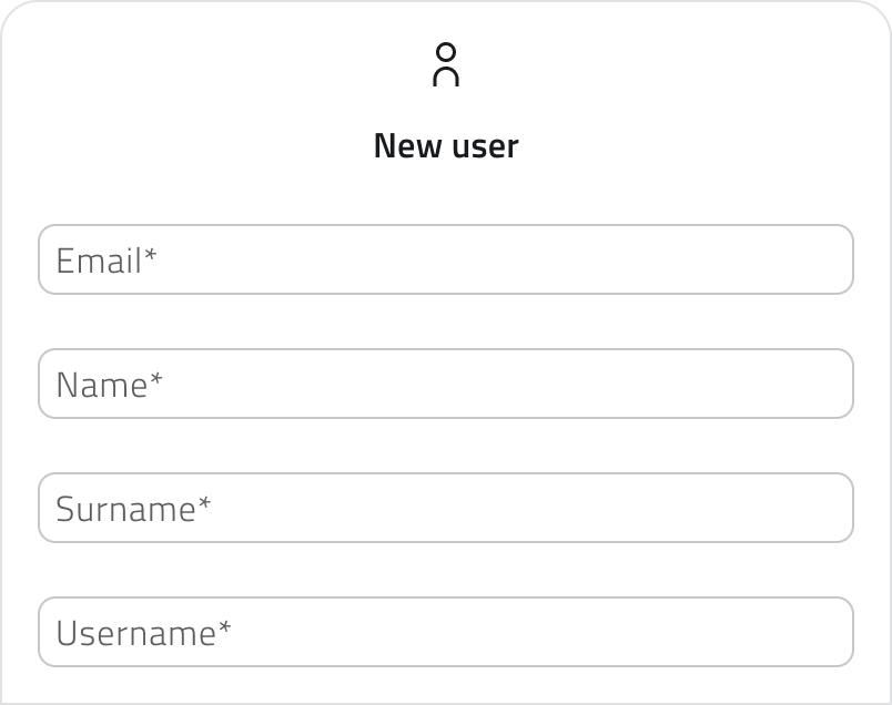
3. Fill in the Email, First Name, Last Name and Username fields.
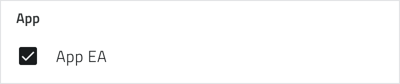
4. Check the checkbox for the app to allow the user to access the operating environment.
The checkbox displays the app’s name as configured within the organization and may therefore vary.
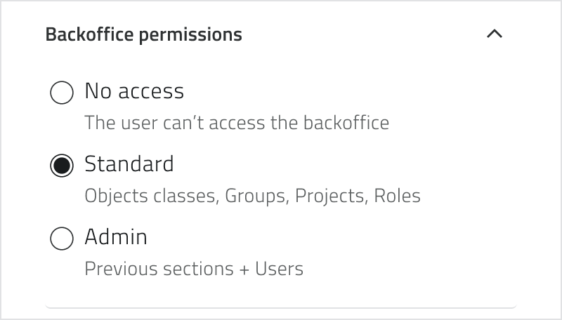
5. Select backoffice permissions:
- No access
- Standard – all sections except Users and Admin
- Admin – full access
6. Click Save to create the account.
The user will receive a welcome email with a link to set their password.
Management and Licenses
To edit a user account, click the blue button with the arrow icon that appears when you hover over the item.
To remove one or more user accounts, select them in the list: the Delete button appears in the top-right corner. Hold CTRL and click to add users to the selection or remove them from it.
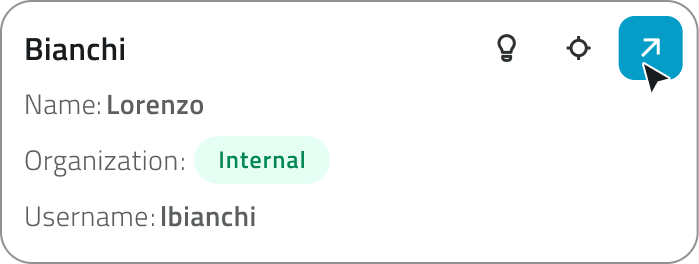
Each organization has a limited number of licenses: one for the app and one for the backoffice. If a user accesses both, they consume two licenses. When licenses are exhausted, the Create New User button is no longer available.
Internal and external utilities
Users can be classified as internal or external based on the email address used during creation.
If the email address is not yet in the system, a new internal user account is created within the organization. If, however, the email address is already associated with an existing user account in another organization, the person is added as an external user.
When an external user is removed from an organization, they remain active in the other organizations with which they are associated. When an internal user is removed, however, they are deleted from the system.
Links
Crea e gestisci gli utenti
Nel Backoffice è possibile creare e gestire le utenze dell’organizzazione.
Ogni utenza identifica un utente abilitato ad accedere all'app o al backoffice, in base ai permessi assegnati.
Disponibile solo per utenti con permesso backoffice-admin.
Creare una nuova utenza
1. Accedi al Backoffice e apri la sezione Utenti.

2. Clicca su Nuovo utente in alto a destra.
3. Compila i campi Email, Nome, Cognome, Username.
4. Spunta la checkbox di accesso all’app per consentire all’utente di entrare nell’ambiente operativo.
La checkbox riporta il nome dell’app così come configurata nell’organizzazione e può quindi variare.
5. Seleziona i permessi per il backoffice:
- Nessun accesso
- Standard – tutte le sezioni tranne Utenti e Admin
- Admin – accesso completo
6. Clicca Salva per creare l’utenza.
L’utente riceverà una mail di benvenuto con il link per impostare la password.
Gestione e licenze
Per modificare un’utenza, clicca sul pulsante blu con l'icona di una freccia, che appare al passaggio del mouse sull'elemento.
Per rimuovere una o più utenze, selezionale nella lista: il pulsante Elimina compare in alto a destra. Tieni premuto CTRL e clicca per aggiungere utenze alla selezione o toglierle.

Ogni organizzazione dispone di un numero limitato di licenze: una per l'app e una per il backoffice. Se un utente accede a entrambi, consuma due licenze. Quando le licenze sono esaurite, il pulsante Nuovo utente non è più disponibile.
Utenze interne ed esterne
Gli utenti possono essere distinti tra interni ed esterni in base all’indirizzo email utilizzato in fase di creazione.
Se l’email non è ancora presente nel sistema, viene creata una nuova utenza interna all’organizzazione. Se invece l’email è già associata a un’utenza esistente in un’altra organizzazione, la persona viene aggiunta come utenza esterna.
Quando un’utenza esterna viene rimossa da un’organizzazione, resta comunque attiva nelle altre organizzazioni a cui è associata. Quando invece viene rimossa un’utenza interna, questa viene eliminata dal sistema.
Collegamenti
Last update: 07 May 2026
Create and manage Object Classes
Creating an Object Class allows you to define the data structure and geometric nature of the objects that will be used in EagleArca projects.
Available only to users with backoffice permission.
Create the Class
1. Access the Backoffice and navigate to Object Classes.

2. Click the New Object button.

3. Enter the Name (unique) and choose the object Type:
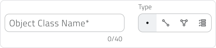
- Point: Vector object, defined by coordinates.
- Line: Vector object, defined by length.
- Polygon: Vector object, defined by area.
- Form: Non-vector object, with no position on the map and no style.
Advanced Settings
Depending on the selected object type, additional configuration options may be available.
If the type is Point, you can enable Oriented Point to store and represent the object direction on the map. This option automatically adds a non-editable system attribute.
If the type is Form, you can enable Global Form to create objects that can be linked to any project and managed from the Global List section.
Configure the Default Style (Vector Objects Only)
The defined style is the default style inherited by all instances.

| Object Type | Key Properties |
| Point | Shape, Size, Stroke, Fill, Orientation |
| Line | Style (solid, dashed, dotted), Thickness, Stroke |
| Polygon | Fill, Stroke |
| All vector objects | Map visibility |
💡 Tip: Maintain the visual hierarchy, for example by using thicker main lines than secondary lines and a semi-transparent fill for the polygons.
Add and Configure Attributes
The system attribute ID / Unique Identifier is locked and cannot be deleted.
To create a new attribute, click the Add attribute button in the upper-right corner.

For each attribute, enter the System Name (required) and, if necessary, the Display Name (optional). Then select the attribute type and choose or create an Attribute Group.
After setting up the main fields, configure the properties available for the selected type. Each attribute type can have specific settings and different properties.
| Attribute type | Function | Attribute properties | Object Class properties |
| Text field | Allows you to enter letters, numbers, or text descriptions. | Can be set as Required or Blocked. A maximum text length can be defined. | Can be set as Main Attribute or Group By Attribute. |
| Numeric field | Allows you to enter numeric values, quantities, or measurements. | Can be set as Required or Blocked. You can choose between integer or real numbers and define a value range. | Can be set as Main Attribute or Group By Attribute. |
| Value list | Allows you to select one or more values from a predefined list. | Can be set as Required or Blocked. The selection can be configured as single answer or multiple answers. | Can be set as Main Attribute or Group By Attribute. |
| Date | Allows you to enter a date or a date with time. | Can be set as Required or Blocked. You can choose between date only or date and time. | Can be set as Main Attribute or Group By Attribute. |
| Attachments | Allows you to upload files associated with the object. | Can be set as Required. You can define which file types can be uploaded: images, videos, or documents. | No Object Class properties are available. |
| Size | Automatically records the object’s geometric information, such as coordinates, length, or area. | No specific attribute properties are available. | Can be set as Main Attribute. |
| True/False | Allows you to choose between two boolean values. | Can be set as Blocked. | Can be set as Group By Attribute. |
| Object list | Allows you to create a list of related sub-attributes, useful for repeated groups of information. | Can be set as Blocked. | No Object Class properties are available. |
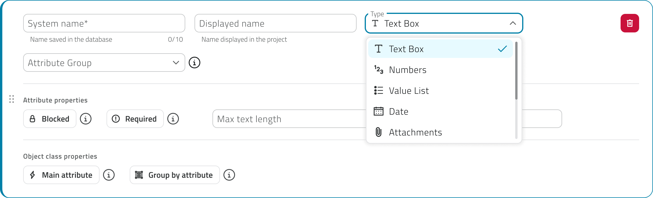
You can reorder the attributes by dragging the cards to the desired position.
💡Tip: Use a meaningful Primary Attribute, choosing a unique attribute to quickly identify instances.
Configure Conditional Styles (Optional)
Conditional styles automatically change the appearance or visibility of objects based on attribute values.

A. Classic Style (for Categories/Statuses)
Ideal for highlighting distinct statuses, such as Verified / To be verified.
1. Click Add style.

2. Click Add condition and define Attribute + Value.
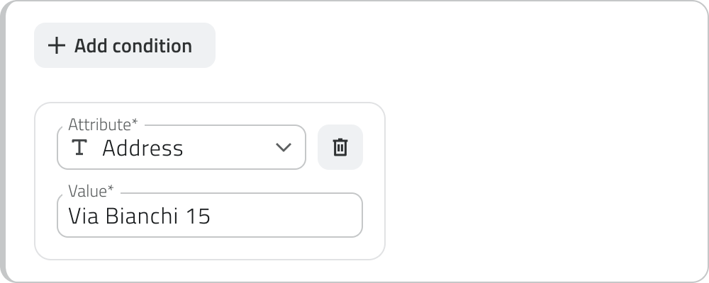
3. Choose the logic between conditions: Every condition or At least 1 condition.

4. Edit the style to apply, such as geometry, color, or pattern.
B. Value Range Style (for Continuous Values)
Ideal for representing a continuous trend, such as height or index.
1. Click Add value range.

2. Select the attribute (numeric, date, or size).
3. Define the stop values (min/max) and customize the style for each stop (color, transparency, etc.).

4. Check the transition using the slider in the preview.
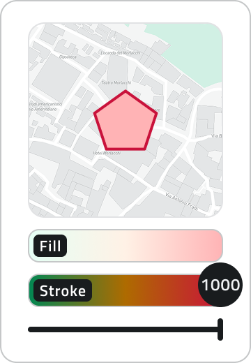
💡 Tip: Use conditional styles if you want the style change to be immediately obvious, or to highlight states and thresholds.
Other Object Class Configurations
In addition to the main structure and attributes, an Object Class can include additional configurations available from the dedicated tabs in the edit page.
From these sections, you can configure relationships with other Object Classes, associate Data Sources and charts to display data collected over time, and define settings for the automatic creation of objects.
Save the Object Class
Click the Save button in the top-right corner of the page.
Saving is disabled until all required fields are completed.
When saving for the first time, a permission setup modal opens.
- Select the default permission to assign to the Object Class.
- The selected permission is applied to all existing roles.
- These settings can be modified later from the Roles page in the Backoffice.
Click Save to confirm and complete the class creation.
Viewing and Editing Object Classes
To edit an Object Class, click the blue button with the arrow icon, which appears when hovering over the element.
To duplicate an Object Class, select an element from the list. After selection, the Duplicate button appears.
To delete one or more Object Classes, select one or more elements from the list. After selection, the Delete button appears. Hold CTRL and click to add elements to the selection or remove them from it.
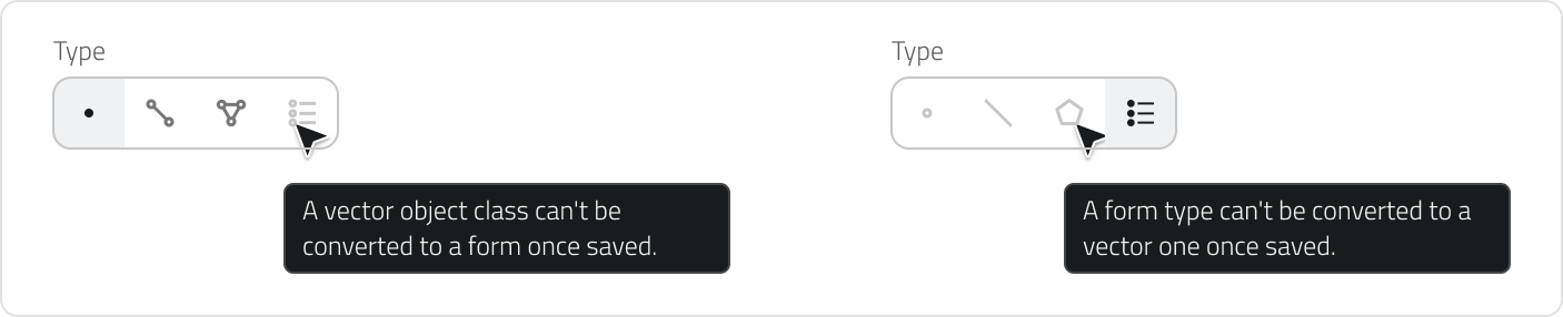
Change the type of an Object Class
The Type of an already saved Object Class can still be modified, as long as no instances of the class have been created in any project.
Enter edit mode on the class and select a different object type from the Type selector.
Once at least one instance exists, the object type selector is locked.
Permitted conversions
| From | To | Allowed |
| Point | Line / Polygon | ✅ Yes |
| Line | Point / Polygon | ✅ Yes |
| Polygon | Point / Line | ✅ Yes |
| Point / Line / Polygon | Form | ❌ No |
| Form | Point / Line / Polygon | ❌ No |
Conversions are therefore only possible between vector types.
Impact on existing configurations
Since each object type supports different properties, changing it affects some of the configurations already set.
When changing, a confirmation modal lists what will be modified upon saving:
- Conditional styles: all conditional styles applied to the class will be removed.
- Automatic objects creation: this feature is only available for Point objects. Changing the object type from Point to Line or Polygon removes the feature, as it is not compatible with these geometries.
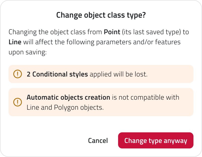
Click Cancel to keep the current object type, or Change type anyway to proceed.
Changes are applied only upon saving the class. If before saving you want to return to the original object type and recover the initial conditional styles, reload the page or exit edit mode without saving.
Links
Creare e gestire le classi di oggetti
Creare una Classe Oggetto consente di definire la struttura dati e la natura geometrica degli oggetti che verranno utilizzati nei progetti di EagleArca.
Disponibile solo per utenti con permesso backoffice.
Creare la Classe
1. Accedi al Backoffice e naviga in Classi Oggetto.
2. Clicca sul pulsante Nuovo oggetto.
3. Inserisci il Nome (univoco) e scegli il Tipo di oggetto:
Punto: Vettoriale, caratterizzato da coordinate.
Linea: Vettoriale, caratterizzata da lunghezza.
Poligono: Vettoriale, caratterizzata da area.
Form: Non vettoriale, senza posizione in mappa e stile.
Impostazioni Avanzate
In base al tipo di oggetto selezionato, possono essere disponibili configurazioni aggiuntive.
Se il tipo è Punto, puoi attivare Punto orientato per memorizzare e rappresentare la direzione dell’oggetto in mappa. L’opzione aggiunge automaticamente un attributo di sistema non modificabile.
Se il tipo è Form, puoi attivare Form globale per creare oggetti collegabili a qualsiasi progetto e gestibili dalla sezione Liste Globali.
Configurare lo Stile di Default (Solo Vettoriali)
Lo stile definito è lo stile di default che tutte le istanze ereditano.
| Tipo Oggetto | Proprietà Chiave |
| Punto | Forma, Dimensione, Contorno (stroke), Riempimento (fill), Orientamento |
| Linea | Stile (continua, a tratti, puntinata), Spessore, Contorno (stroke) |
| Poligono | Riempimento (fill), Contorno (stroke) |
| Tutti i vettoriali | Visibilità in mappa |
💡 Suggerimento: Mantieni la gerarchia visiva, ad esempio utilizzando linee principali più spesse delle secondarie e un riempimento semi-trasparente per i poligoni.
Aggiungere e Configurare gli Attributi
L'attributo di sistema ID / Identificatore Unico è bloccato e non eliminabile.
Per creare un nuovo attributo, clicca sul pulsante Aggiungi attributo in alto a destra.
Per ogni attributo inserisci il Nome di sistema (obbligatorio) e, se lo ritieni necessario, il Nome in visualizzazione (facoltativo). Seleziona poi il tipo di attributo e scegli o crea un Gruppo attributi.
Dopo aver impostato i campi principali, configura le proprietà disponibili per la tipologia scelta. Ogni tipo di attributo può avere impostazioni specifiche e proprietà diverse.
| Tipo di attributo | Funzione | Proprietà dell’attributo | Proprietà della Classe Oggetto |
| Campo di testo | Permette di inserire lettere, numeri o descrizioni testuali. | Può essere impostato come Obbligatorio o Bloccato. È possibile definire una lunghezza massima del testo. | Può essere impostato come Attributo principale o come Raggruppa per attributo. |
| Campo numerico | Permette di inserire valori numerici, quantità o misurazioni. | Può essere impostato come Obbligatorio o Bloccato. È possibile scegliere tra numeri interi o reali e definire un intervallo di valori. | Può essere impostato come Attributo principale o come Raggruppa per attributo. |
| Lista valori | Permette di selezionare uno o più valori da un elenco predefinito. | Può essere impostata come Obbligatoria o Bloccata. È possibile configurare la selezione come risposta singola o risposte multiple. | Può essere impostata come Attributo principale o come Raggruppa per attributo. |
| Data | Permette di inserire una data o una data con orario. | Può essere impostata come Obbligatoria o Bloccata. È possibile scegliere tra formato solo data o data e ora. | Può essere impostata come Attributo principale o come Raggruppa per attributo. |
| Allegati | Permette di caricare file associati all’oggetto. | Può essere impostato come Obbligatorio. È possibile definire quali tipi di file caricare: immagini, video o documenti. | Non sono disponibili proprietà di Classe Oggetto. |
| Dimensione | Registra automaticamente informazioni geometriche dell’oggetto, come coordinate, lunghezza o area. | Non sono disponibili proprietà specifiche dell’attributo. | Può essere impostata come Attributo principale. |
| Vero/Falso | Permette di scegliere tra due valori booleani. | Può essere impostato come Bloccato. | Può essere impostato come Raggruppa per attributo. |
| Lista oggetti | Permette di creare una lista di sotto-attributi correlati, utile per gruppi di informazioni ripetute. | Può essere impostata come Bloccata. | Non sono disponibili proprietà di Classe Oggetto. |
Puoi riordinare gli attributi trascinando le card nella posizione desiderata.
💡 Suggerimento: Usa un Attributo Principale significativo, scegliendo un attributo univoco per identificare rapidamente le istanze.
Configurare Stili Condizionali (Opzionale)
Gli stili condizionali modificano automaticamente l’aspetto o la visibilità in base ai valori degli attributi.
A. Stile Classico (per Categorie/Stati)
Ideale per evidenziare stati distinti (es. Verificato/Da verificare).
1. Clicca Aggiungi Stile.
2. Clicca Aggiungi condizione e definisci Attributo + Valore.
3. Scegli la logica tra le condizioni: Tutte le condizioni o Almeno una condizione.
4. Modifica lo stile (geometria, colore, pattern) da applicare.
B. Stile con Range di Valori (per Grandezze Continue)
Ideale per rappresentare un andamento continuo (es. altezza, indice).
1. Clicca Aggiungi Range di valori.
2. Seleziona l'attributo (numerico, data o dimensione).
3. Definisci i valori di stop (min/max) e personalizza lo stile per ciascuno stop (colore, trasparenza, ecc.).
4. Verifica la transizione con lo slider nella preview.
💡 Suggerimento: Utilizza gli stili condizionali se vuoi che il cambio di stile sia immediatamente interpretabile, o per evidenziare stati e soglie.
Altre configurazioni della Classe Oggetto
Oltre alla struttura principale e agli attributi, la Classe Oggetto può includere configurazioni aggiuntive disponibili dalle tab dedicate nella pagina di modifica.
Da queste sezioni è possibile configurare le relazioni con altre Classi Oggetto, associare Sorgenti dati e grafici per visualizzare dati raccolti nel tempo, e definire impostazioni per la creazione automatica degli oggetti.
Salvare la Classe Oggetto
Clicca il pulsante Salva in alto a destra della pagina.
Il salvataggio è disabilitato finché tutti i requisiti obbligatori non sono soddisfatti.
Al primo salvataggio, si apre un modale di impostazione dei permessi.
-
Seleziona il permesso di default da assegnare alla Classe Oggetto.
-
Il permesso scelto viene applicato a tutti i ruoli esistenti.
-
Le impostazioni possono essere modificate in seguito dalla pagina Ruoli del Backoffice.
Salva per confermare e completare la creazione della classe.
Visualizzazione e Modifica delle Classi Oggetto
Per modificare una Classe Oggetto, clicca sul pulsante blu con l'icona di una freccia, che appare al passaggio del mouse sull'elemento.
Per duplicare una Classe Oggetto, seleziona un elemento dalla lista. Dopo la selezione, compare il pulsante Duplica.
Per eliminare una o più Classi Oggetto, seleziona uno o più elementi dalla lista. Dopo la selezione, compare il pulsante Elimina. Tieni premuto CTRL e clicca per aggiungere elementi alla selezione o toglierli.
Modificare il tipo di una Classe Oggetto
Il Tipo di una Classe Oggetto già salvata può ancora essere modificato, a condizione che non siano state create istanze della classe in nessun progetto.
Entra in modifica della classe e seleziona un tipo di oggetto differente dal selettore Tipo.
Quando esiste almeno un'istanza, il selettore del tipo di oggetto è bloccato.
Conversioni consentite
| Da | A | Consentito |
| Punto | Linea / Poligono | ✅ Sì |
| Linea | Punto / Poligono | ✅ Sì |
| Poligono | Punto / Linea | ✅ Sì |
| Punto / Linea / Poligono | Form | ❌ No |
| Form | Punto / Linea / Poligono | ❌ No |
Le conversioni sono quindi possibili solo tra tipi vettoriali.
Impatto sulle configurazioni esistenti
Poiché ogni tipo di oggetto supporta proprietà differenti, cambiarlo ha effetto su alcune configurazioni già impostate.
Al cambio, un modale di conferma elenca ciò che verrà modificato al salvataggio:
- Stili condizionali: tutti gli stili condizionali applicati alla classe verranno rimossi.
- Creazione automatica degli oggetti: la funzionalità è disponibile solo per gli oggetti di tipo Punto. Cambiando il tipo di oggetto da Punto a Linea o Poligono, viene rimossa la funzionalità, perché non compatibile con queste geometrie.
Clicca Annulla per mantenere il tipo di oggetto attuale, oppure Cambia tipo comunque per procedere.
Le modifiche vengono applicate solo al salvataggio della classe. Se prima di salvare vuoi tornare al tipo di oggetto di partenza e recuperare gli stili condizionali iniziali, ricarica la pagina o esci dalla modifica senza salvare.
Collegamenti
Last update: 17 August 2026
Configure relations between objects
Relations are an attribute type that allows you to connect objects belonging to different object classes, creating structured links between the elements of the project.
This function allows you to represent logical relationships between instances. For example, you can connect a road to the lighting poles along its route, or associate a road with the road signs installed along it.
Relations are configured during the creation or editing of an object class, inside a dedicated section.
Available only to users with backoffice permissions.
How relations work
A relation always connects two object classes:
- Current object class
This is the class you are configuring at that moment in the Backoffice. - Linked object class
This is the class with which the objects of the current class can be linked.
When a relation is configured between two classes, objects can be associated with one or more instances of the related class.
The number of objects that can be linked depends on the cardinality set in the relation.
Set up relations
To configure a relationship between object classes, open the Backoffice, access the edit page of an object class, and select the Relations tab.

To create a new relationship, click the Add relation button.
The configuration is divided into two sections: This object class and Is related to.
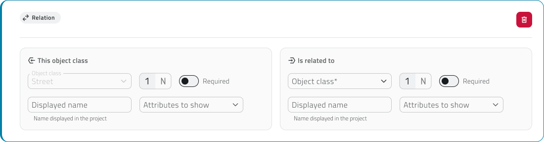
Current object class
The This object class section represents the object class you are editing.
The Object class field is filled in automatically and cannot be edited.
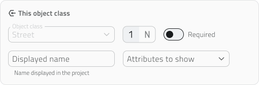
In this section, you can configure:
- Cardinality: select 1 or N to indicate how many objects of the current class can be linked to objects of the other class.
- Required: activate the switch if this object class is necessary for the existence of the other one.
If the switch is active, an object of the other class can exist only if it is linked to an object of this class. - Displayed name: when an object with a relationship is created and displayed in the app, the relationship attribute has a name. If necessary, you can enter the name with which this class is shown in the relationship.
If no name is set, the system automatically uses the name of the object class. - Attributes to show: when an object with a relationship is created and displayed in the app, the related object class appears in the relationship attribute. The related class can be expanded to show a preview of its attributes. With this field, you can choose which attributes to show. You cannot select attributes of type relationship or object list.
Linked object class
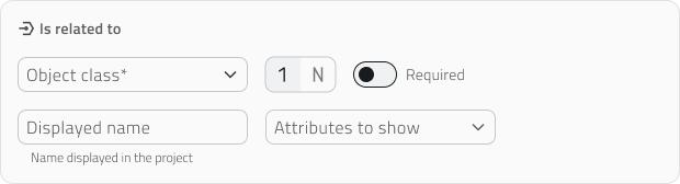
You can also configure the following fields for this class:
- Cardinality: select 1 or N to indicate how many objects of the linked class can be associated with an object of the current class.
- Required: activate the switch if the linked object class is necessary for the existence of the current class.
If the switch is active, an object of the current class can exist only if it is linked to an object of this class. - Displayed name: if necessary, you can enter the name with which the linked class is shown in the relationship.
If no name is set, the system automatically uses the name of the linked object class. - Attributes to show: with this field, you can choose which attributes to show, but only after selecting the class. You cannot select attributes of type relationship or object list.
Relationship cardinality
The overall cardinality of the relationship depends on the combination of the values set in the two sections.
| Configuration | Meaning |
|
1 → 1 |
one object can be linked to one object only |
|
1 → N |
one object can be linked to multiple objects |
| N → 1 | multiple objects can be linked to one object |
| N → N | multiple objects can be linked to each other |
Only one of the two classes can be required, making one class necessary for the existence of the other.
💡 Tip: Limit the attributes to display to keep the attributes panel more readable.
Configuration rules and conditions
A current object class cannot be set as required if the linked object class already has created instances.
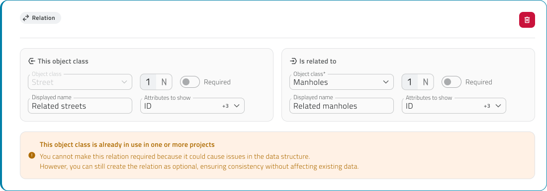
After saving a relationship, it is not possible to edit:
- the cardinality
- the linked object class
- the required status
To configure a relationship on an object class of type Form or Global Form, the class must be saved first. After saving, re-enter edit mode for the object class and open the Relations section to create the relationship.
If a relationship is deleted, the system automatically removes the link from all involved instances.
Links
Configurare le relazioni tra gli oggetti
Le relazioni sono una tipologia di attributo che permette di collegare tra loro oggetti appartenenti a classi oggetto diverse, creando legami strutturati tra gli elementi del progetto.
Questa funzione consente di rappresentare relazioni logiche tra istanze. Ad esempio, puoi collegare una strada ai pali dell’illuminazione presenti lungo il suo tracciato oppure associare una strada ai segnali stradali installati lungo di essa.
Le relazioni vengono configurate durante la creazione o la modifica di una classe oggetto, all’interno di una sezione dedicata.
Disponibile solo per utenti con permesso backoffice.
Come funzionano le relazioni
Una relazione collega sempre due classi oggetto:
- Classe oggetto corrente
È la classe che stai configurando in quel momento nel Backoffice. - Classe oggetto collegata
È la classe con cui gli oggetti della classe corrente possono essere collegati.
Quando una relazione viene configurata tra due classi, gli oggetti possono essere associati a una o più istanze della classe relazionata.
Il numero di oggetti collegabili dipende dalla cardinalità impostata nella relazione.
Configurare le relazioni
Per configurare una relazione tra classi oggetto, apri il Backoffice, accedi alla pagina di modifica di una classe oggetto e seleziona la tab Relazioni.
Per creare una nuova relazione clicca sul pulsante Aggiungi relazione.
La configurazione è suddivisa in due sezioni: Questa classe oggetto e È legata a.
Classe oggetto corrente
La sezione Questa classe oggetto rappresenta la classe oggetto che stai modificando.
Il campo Classe oggetto è compilato automaticamente e non può essere modificato.
In questa sezione puoi configurare:
- Cardinalità: seleziona 1 oppure N per indicare quanti oggetti della classe corrente possono essere collegati agli oggetti dell'altra classe.
- Obbligatoria: attiva lo switch se questa classe oggetto è necessaria per l’esistenza dell’altra.
Se lo switch è attivo, un oggetto dell’altra classe può esistere solo se è collegato a un oggetto di questa classe.
- Nome visualizzato: quando un oggetto con una relazione viene creato e visualizzato nell’app, l’attributo della relazione ha un nome. Se necessario, puoi inserire il nome con cui questa classe viene mostrata nella relazione.
Se non viene impostato un nome, il sistema utilizza automaticamente il nome della classe oggetto. - Attributi da mostrare: quando un oggetto con una relazione viene creato e visualizzato nell’app, la classe oggetto relazionata compare nell’attributo della relazione. La classe relazionata può essere espansa per mostrare un’anteprima dei suoi attributi. Con questo campo puoi scegliere quali attributi mostrare. Non puoi selezionare attributi di tipo relazione o lista oggetti.
Classe oggetto collegata
La sezione È legata a permette di definire la classe oggetto da collegare alla classe corrente.
Nel campo Classe oggetto, seleziona dal menu a tendina la classe con cui creare la relazione.
Anche per questa classe puoi configurare:
- Cardinalità: seleziona 1 oppure N per indicare quanti oggetti della classe collegata possono essere associati a un oggetto della classe corrente.
- Obbligatoria: attiva lo switch se la classe oggetto collegata è necessaria per l’esistenza della classe corrente.
Se lo switch è attivo, un oggetto della classe corrente può esistere solo se è collegato a un oggetto di questa classe. - Nome visualizzato: Se necessario, puoi inserire il nome con cui la classe collegata viene mostrata nella relazione.
Se non viene impostato un nome, il sistema utilizza automaticamente il nome della classe oggetto collegata. - Attributi da mostrare: con questo campo puoi scegliere quali attributi mostrare, ma solo dopo aver selezionato la classe. Non puoi selezionare attributi di tipo relazione o lista oggetti.
Cardinalità della relazione
La cardinalità complessiva della relazione dipende dalla combinazione dei valori impostati nelle due sezioni.
| Configurazione | Significato |
|
1 → 1 |
un oggetto può essere collegato a un solo oggetto |
|
1 → N |
un oggetto può essere collegato a più oggetti |
| N → 1 | più oggetti possono essere collegati a uno |
| N → N | più oggetti possono essere collegati tra loro |
Solo una delle due classi può essere obbligatoria, rendendo una classe necessaria per l'esistenza dell'altra.
💡 Suggerimento: Limita gli attributi da visualizzare per lasciare il pannello attributi più leggibile.
Regole e condizioni di configurazione
Una classe oggetto corrente non può essere impostata come obbligatoria se la classe oggetto collegata ha già delle istanze create.
Dopo il salvataggio di una relazione, non è possibile modificare:
- la cardinalità
- la classe oggetto collegata
- lo stato obbligatorio
Per configurare una relazione su una classe oggetto di tipo Form o Form globale, la classe deve essere prima salvata. Dopo il salvataggio, rientra in modifica nella classe oggetto e apri la sezione Relazioni per creare la relazione.
Se una relazione viene eliminata, il sistema rimuove automaticamente il collegamento da tutte le istanze coinvolte.
Collegamenti
Last update: 08 May 2026
Configure Data Sources and Charts
A Data Source is a data source that can be associated with an object class and allows you to collect and display information organized over time.
This function allows you to connect objects to data coming from sensors or other configured sources, so that it can be viewed through charts in the object detail panel. For example, you can associate an environmental sensor with a Data Source that records temperature, humidity, or other monitored values.
Data Sources and charts are configured during the creation or editing of an object class, inside a dedicated section.
Available only with sensors configured in advance.
Configuration
To configure data sources and charts, open the Backoffice, access the edit page of an object class, and select the Data Sources tab.

Add a Data Source
To create a new data source, click the Add data source button.
Select the data source type and enter an identifying name (e.g. Type Thermometer, Name Thermometer 1).

Add a Chart
The option to add charts becomes available only after at least one data source has been added.
To create a new chart, click the Add chart button.
Enter an identifying name and select the chart type (Line, Counter, Bar, Scatter, 3D Scatter, Heatmap).

At this point, you can configure different sections:
- Data (required)
- Customization (optional)
- Style (optional)
💡 Tip: Assign clear and descriptive names to data sources and charts (e.g. “Thermometer Floor 1”) to make them easier to manage.
Configure the Chart
Data Section
The Data section defines which data is displayed in the chart and which Data Source it is retrieved from.
The first field to complete is Data compression, which allows you to choose how the available data is handled before it is displayed in the chart.
You can select one of the following methods:
- Aggregation over time: Groups the collected data into time intervals and shows a summarized value for each period. This is useful when there is a large amount of data and a more compact view of the trend is needed.
- Downsampling: Reduces the number of displayed data points by keeping only part of the available values. This is useful to make the chart lighter when the amount of data is high.
After choosing the compression method, configure the Main data source.
In this section, select the Data Source that feeds the chart from those previously created.
Once the Data Source has been selected, specify which values must be used for the chart axes. The available axes change depending on the selected chart type.
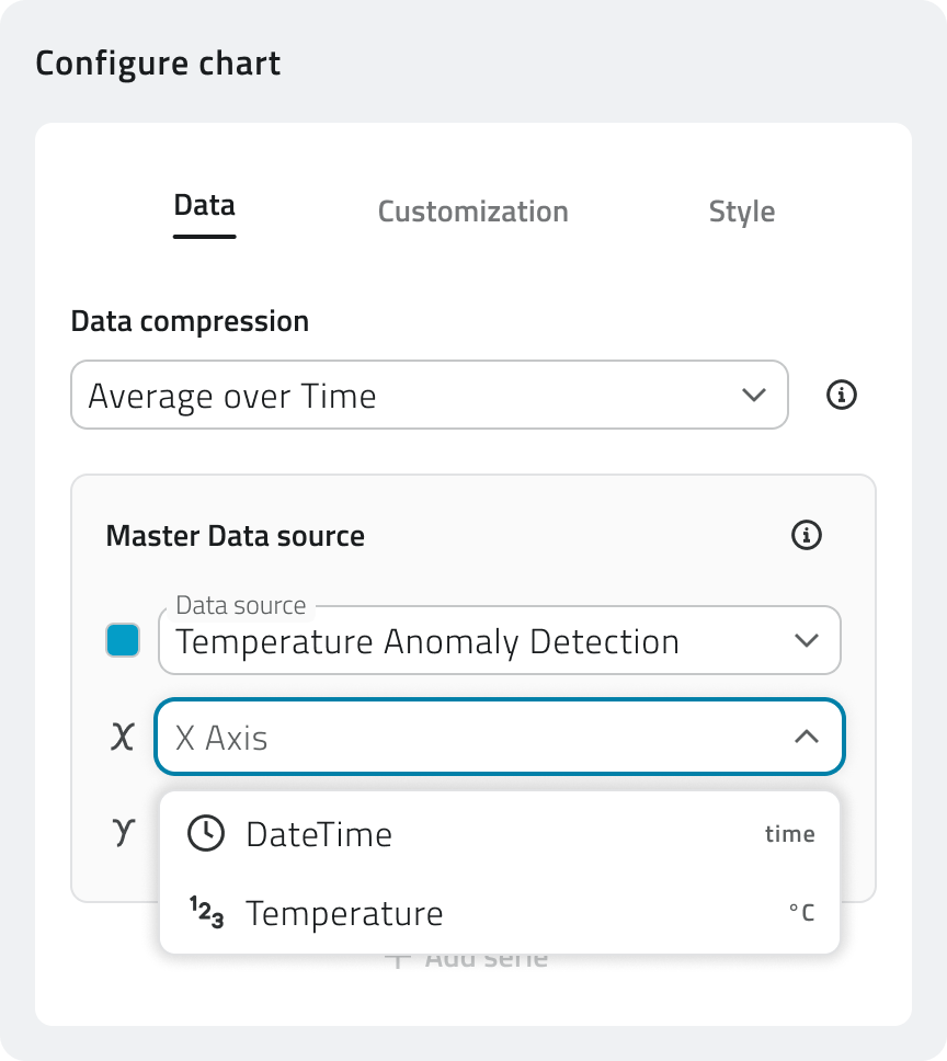
You can add multiple data series, and therefore multiple Data Sources, by clicking Add series.
For Counter charts, click Add value instead.
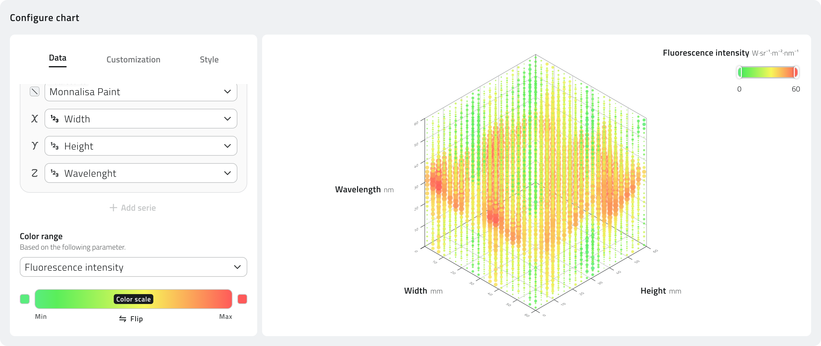
For the 3D Scatter chart, the Color range is also available.
This field allows you to select a numeric parameter to use for coloring the chart points according to their value. The system applies a color scale that helps visually distinguish lower, intermediate, or higher values within the data distribution.
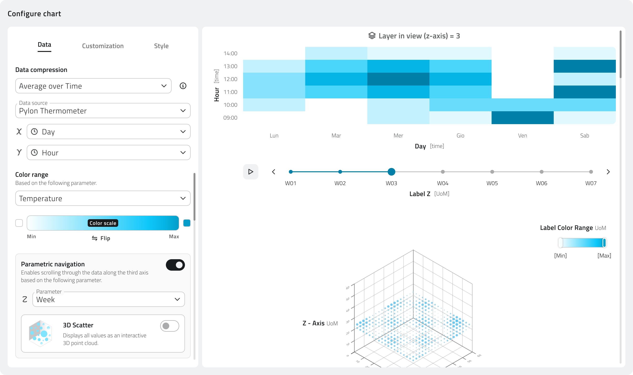
For the Heatmap chart, the Color range is also available. It defines the numeric parameter used to generate the color intensity of the map. The color therefore represents the variation of the selected value across the different areas or positions of the chart.
For the Heatmap, you can also enable Parametric navigation.
This option allows you to select an additional parameter to use as a data navigation level. In this way, you can browse the Heatmap by layers, displaying different data layers according to the value of the selected parameter.
Customization Section
The option to customize the chart becomes available only after the Data section has been completed.
The Customization section allows you to define how the chart is presented in the object detail panel.
From here, you can edit texts, thresholds, axis scaling, and the values shown when the chart is opened.
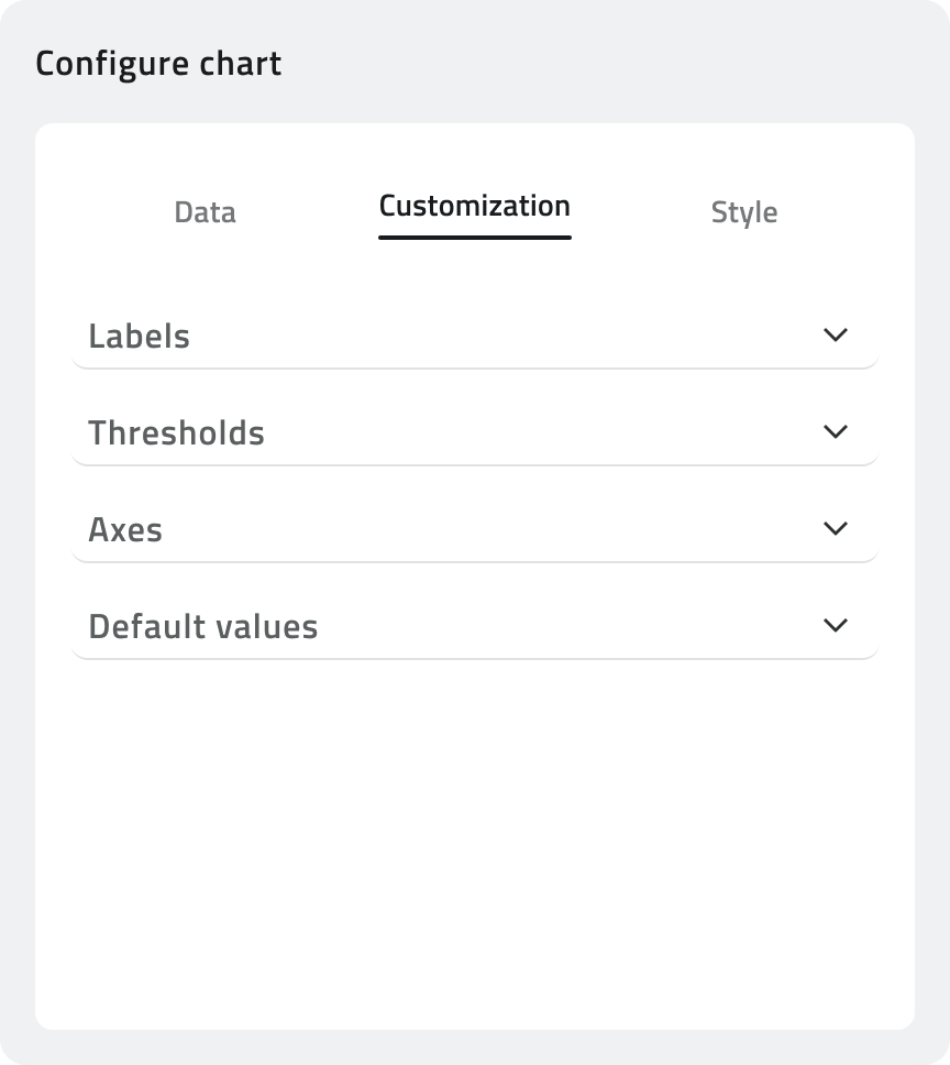
Labels
In this section, you can configure the texts displayed in the chart.
You can enter a title, a subtitle, and the axis labels, for example X Axis and Y Axis.
To make the chart clearer, you can also include the unit of measurement in the axis labels.
Thresholds
Thresholds allow you to highlight reference values or critical values within the chart.
For each threshold, you can configure:
- Name, to identify the threshold in the chart.
- Axis, to indicate which axis the threshold applies to.
- Trigger value, to define the reference value to highlight.
This configuration is useful, for example, to indicate that a maximum temperature, a minimum level, or any other monitored value has been exceeded.
Axes
In this section, you can define how the scale of the values shown in the chart is calculated.
You can choose from:
- Auto-scale, where the system automatically adapts the scale based on the values shown in the chart.
- Fixed scale, which allows you to manually set a minimum and maximum range. This is useful when you want to compare different charts while keeping the same reference scale.
- Relative scale, which applies a percentage margin based on the values shown in the chart. This is useful when you want to keep a dynamic scale while adding extra visual space above and below the displayed values.
Default values
This section allows you to configure the initial values shown when the object detail panel is opened.
You can define:
- Aggregation interval, to establish how the data is grouped in the initial view.
- Time period, to indicate the time range displayed when the chart is opened.
💡 Tip: Use Thresholds if you want to automatically highlight anomalous values in the chart.
Style Section
Available only when a single data series is configured in the Data section.
This section allows you to create one or more conditional styles, that is, rules that change the appearance of the chart when specific conditions are met.
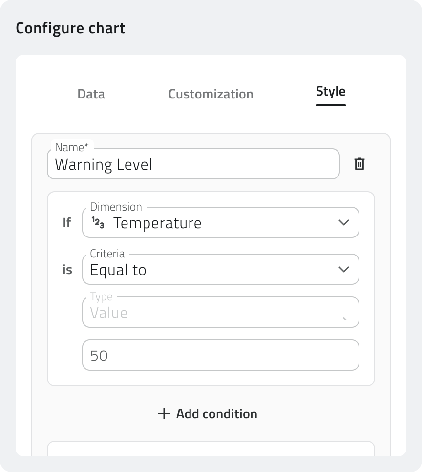
For each conditional style, you must enter a name, useful for recognizing the configured rule.
In the conditions section, you can define when the style must be applied.
Each condition is composed of:
- Reference parameter, which is the value to check.
- Criterion, which is the rule to verify, for example greater than, less than, or equal to.
- Type, which is the way the comparison value is specified.
- Value, which is the value that activates the condition.
You can add multiple conditions by clicking Add condition.
In the Style section, you can choose the color to apply to the chart when the defined conditions are met.
The Reset button restores the style to the default value.
You can configure multiple styles, by clicking Add conditional style, so that different colors are applied based on different thresholds or states.
Links
Configurazione delle sorgenti dati e dei grafici
Una Sorgente dati è una fonte dati associabile a una classe oggetto, che permette di raccogliere e visualizzare informazioni organizzate nel tempo.
Questa funzione consente di collegare agli oggetti dati provenienti da sensori o altre fonti configurate, così da consultarli tramite grafici nel dettaglio dell’oggetto. Ad esempio, puoi associare a un sensore ambientale una Sorgente dati che registra temperatura, umidità o altri valori monitorati.
Le Sorgenti dati e i grafici vengono configurati durante la creazione o la modifica di una classe oggetto, all’interno di una sezione dedicata.
Disponibile solo con sensori configurati in precedenza.
Configurazione
Per configurare sorgenti dati e grafici, apri il Backoffice, accedi alla pagina di modifica di una classe oggetto e seleziona la tab Rappresentazione di dati.
Aggiungere Sorgenti dati
Per creare una nuova sorgente dati clicca sul pulsante Aggiungi sorgente dati.
Seleziona il tipo di sorgente dati e imposta un nome identificativo (Es: Type Thermometer, Name Termometro 1).
Aggiungere Grafico
La possibilità di aggiungere grafici diventa disponibile solo se è stata aggiunta almeno una sorgente dati.
Per creare un nuovo grafico clicca sul pulsante Aggiungi grafico.
Imposta il nome identificativo e seleziona il tipo di grafico (Line, Counter, Bar, Scatter, 3D Scatter, Heatmap).
A questo punto puoi configurare diverse sezioni:
-
Dati (obbligatoria)
-
Personalizzazione (facoltativa)
-
Stile (facoltativa)
💡 Suggerimento: Assegna nomi chiari e descrittivi a sorgenti dati e grafici (es. "Termometro Piano 1") per facilitarne la gestione.
Configurare il Grafico
Sezione Dati
La sezione Dati definisce quali dati vengono visualizzati nel grafico e da quale Sorgente dati vengono recuperati.
Il primo campo da compilare è la Compressione dati, che permette di scegliere come gestire i dati disponibili prima della visualizzazione nel grafico.
Puoi selezionare uno dei seguenti metodi:
- Aggregazione per periodo: Raggruppa i dati raccolti in intervalli di tempo e mostra un valore sintetico per ogni periodo. È utile quando sono presenti molti dati e serve una lettura più compatta dell’andamento.
- Sottocampionamento: Riduce il numero di dati visualizzati mantenendo solo una parte dei valori disponibili. È utile per alleggerire la visualizzazione del grafico quando la quantità di dati è elevata.
Dopo aver scelto il metodo di compressione, configura la Sorgente dati principale.
In questa sezione è necessario selezionare la Sorgente dati che alimenta il grafico tra quelle create in precedenza.
Una volta selezionata la Sorgente dati, specifica quali valori devono essere utilizzati negli assi del grafico. Gli assi disponibili cambiano in base alla tipologia di grafico selezionata.
È possibile aggiungere più serie di dati, e quindi più Sorgente dati, cliccando Aggiungi serie.
Per i grafici di tipo Counter, clicca invece Aggiungi valore.
Nel caso del grafico 3D Scatter, è disponibile anche il Campo colore.
Questo campo permette di selezionare un parametro numerico da usare per colorare i punti del grafico in base al loro valore. Il sistema applica una scala colore che aiuta a distinguere visivamente valori più bassi, intermedi o più alti all’interno della distribuzione dei dati.
Nel caso del grafico Heatmap, è disponibile il Campo colore, che definisce il parametro numerico usato per generare l’intensità cromatica della mappa. Il colore rappresenta quindi la variazione del valore selezionato nelle diverse aree o posizioni del grafico.
Per la Heatmap puoi inoltre abilitare la Navigazione parametrica.
Questa opzione consente di selezionare un ulteriore parametro da usare come livello di navigazione dei dati. In questo modo è possibile consultare la Heatmap per strati, visualizzando layer diversi in base al valore del parametro scelto.
Sezione Personalizzazione
La possibilità di personalizzare il grafico diventa disponibile solo se è stata completata la sezione Dati.
La sezione Personalizzazione permette di definire come il grafico viene presentato nel dettaglio dell’oggetto.
Da qui puoi modificare testi, soglie, scala degli assi e valori mostrati all’apertura del grafico.
Etichette
In questa sezione puoi configurare i testi visualizzati nel grafico.
Puoi inserire un titolo, un sottotitolo e le etichette degli assi, ad esempio Asse X e Asse Y.
Per rendere il grafico più chiaro, nelle etichette degli assi puoi indicare anche l’unità di misura del valore rappresentato.
Soglie
Le soglie permettono di evidenziare valori di riferimento o valori critici all’interno del grafico.
Per ogni soglia puoi configurare:
- Nome, per identificare la soglia nel grafico.
- Asse, per indicare a quale asse applicare la soglia.
- Valore di attivazione, per definire il valore di riferimento da evidenziare.
Questa configurazione è utile, ad esempio, per segnalare il superamento di una temperatura massima, di un livello minimo o di qualsiasi altro valore da tenere sotto controllo.
Assi
In questa sezione puoi definire come viene calcolata la scala dei valori mostrati nel grafico.
Puoi scegliere tra:
- Scala automatica, con cui il sistema adatta automaticamente la scala in base ai valori presenti nel grafico.
- Scala fissa, che permette di impostare manualmente un intervallo minimo e massimo. È utile quando vuoi confrontare grafici diversi mantenendo sempre la stessa scala di riferimento.
- Scala relativa, che applica un margine percentuale rispetto ai valori presenti nel grafico. È utile quando vuoi mantenere una scala dinamica, ma con uno spazio visivo aggiuntivo sopra e sotto i valori rappresentati.
Valori predefiniti
Questa sezione permette di configurare i valori iniziali mostrati quando si apre il dettaglio dell’oggetto.
Puoi definire:
- Intervallo di aggregazione, per stabilire come i dati vengono raggruppati nella vista iniziale.
- Periodo temporale, per indicare l’intervallo di tempo visualizzato all’apertura del grafico.
💡 Suggerimento: Usa le Soglie se vuoi evidenziare automaticamente valori anomali sul grafico.
Sezione Stile
Disponibile solo se è configurato una sola serie di dati nella sezione Dati.
Questa sezione permette di creare uno o più stili condizionali, cioè regole che modificano l’aspetto del grafico quando si verificano determinate condizioni.
Per ogni stile condizionale è necessario inserire un nome, utile per riconoscere la regola configurata.
Nella sezione delle condizioni puoi definire quando lo stile deve essere applicato.
Ogni condizione è composta da:
- Parametro di riferimento, cioè il valore da controllare.
- Criterio, cioè la regola da verificare, ad esempio maggiore di, minore di o uguale a.
- Tipo, cioè la modalità con cui viene indicato il valore di confronto.
- Valore, cioè il valore che attiva la condizione.
Puoi aggiungere più condizioni cliccando su Aggiungi condizione.
Nella sezione Stile puoi scegliere il colore da applicare al grafico quando le condizioni definite sono soddisfatte.
Il pulsante Reset ripristina lo stile al valore predefinito.
È possibile configurare più stili, cliccando su Aggiungi stile condizionale, così da applicare colori diversi in base a soglie o stati differenti.
Collegamenti
Last update: 08 May 2026
Configure automatic object creation
Automatic object creation allows the platform to generate instances of an object class from data received from a data source, without the user having to intervene manually from the project.
Automatic object creation is only available for object classes of type Point and Form. Form classes do not have a coordinates section, so only the attribute values are configured.
Available only with sensors configured in advance.
Prerequisites
The automatic object creation configuration is accessible from the Data Sources tab in the object class creation or editing page, in the Automatic object creation section at the bottom of the page.
To unlock this function, the following must be configured in the object class:
- exactly one data source
- at least one chart
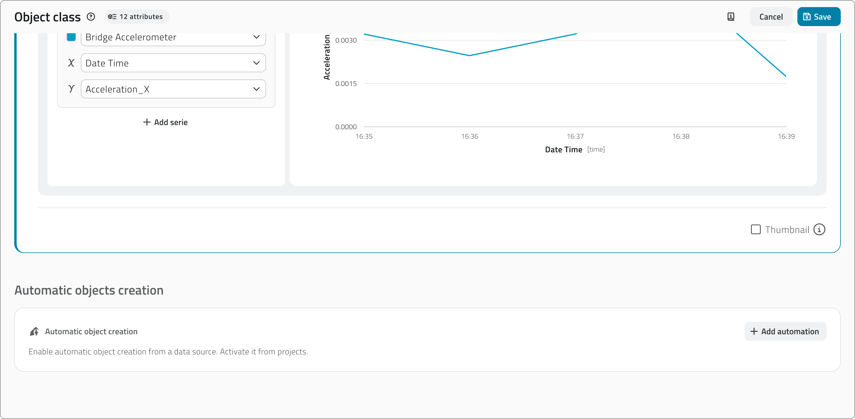
If more than one data source is added, the button to add the automation is disabled. Conversely, if an automation is already configured, the button to add further data sources is disabled.
Modifying the data source associated with the object class will cause the loss of the entire configuration of the automatic object creation.
Adding the automation
Click the + Add automation button to open the configuration card.
The configuration card is divided into several sections.
Projects where automation is active
Shows the projects in which automatic creation is currently enabled. The configuration is carried out in the project configuration page in the Backoffice.

This section is useful when editing the class to have an understanding of where the changes will have an impact.
Automation start date
Select the date from which the automation should be active. The selector defaults to today's date, but past or future dates can be selected. If the date is modified, the reset button is enabled to return to the current date.
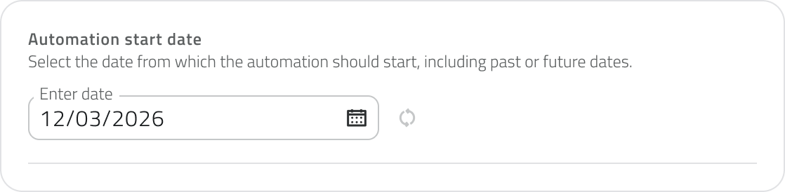
When editing the object class, the selector is read-only if the selected date is in the past or is the current day. If the date is in the future, it can still be modified.
Creation coordinates
Available only for object classes of type Point.
Defines the coordinates that will be used to position automatically created objects. Values can come from the data source (Data source, dynamic) or be entered manually (Custom, static). For each coordinate it is mandatory to indicate a fallback value, used in case the data source returns a null value.
Using the 2D and 3D tabs you can choose whether to create objects in 2D or 3D. Selecting 3D also displays the Elevation field.
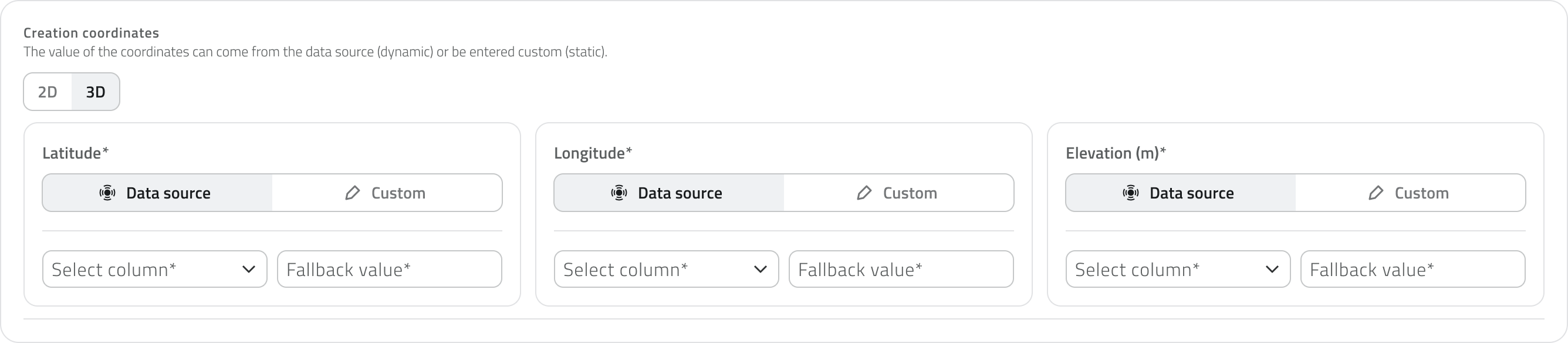
The fallback value is used when the data source returns a null value in the selected column. It ensures that fields do not remain empty and data is always complete. For coordinates, the field is always mandatory.
If Custom is selected for elevation, the fallback value corresponds to the default height at which objects are created in the platform. If this value is modified, the reset button is enabled to return to the original value.
Attribute values
Defines the values that will be assigned to the attributes of automatically created objects. For each attribute it is possible to choose whether the value should come from the data source (Data source, dynamic) or be defined manually (Custom, static).
The attributes configurable from this section are: text, numbers, true/false, value list and date. Other attribute types cannot be pre-filled here.
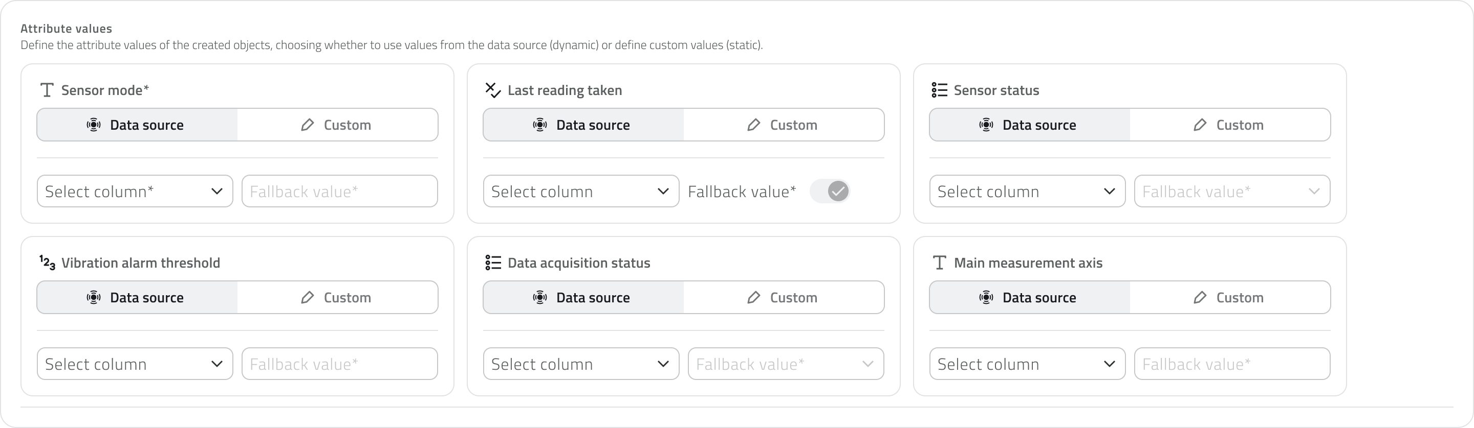
The mandatory nature of the fields mirrors what is defined in the Attributes tab of the object class.
The fallback value is used when the data source returns a null value in the selected column. It corresponds to the default value of the attributes and is only enabled if the attribute is mandatory.
Viewing the configuration
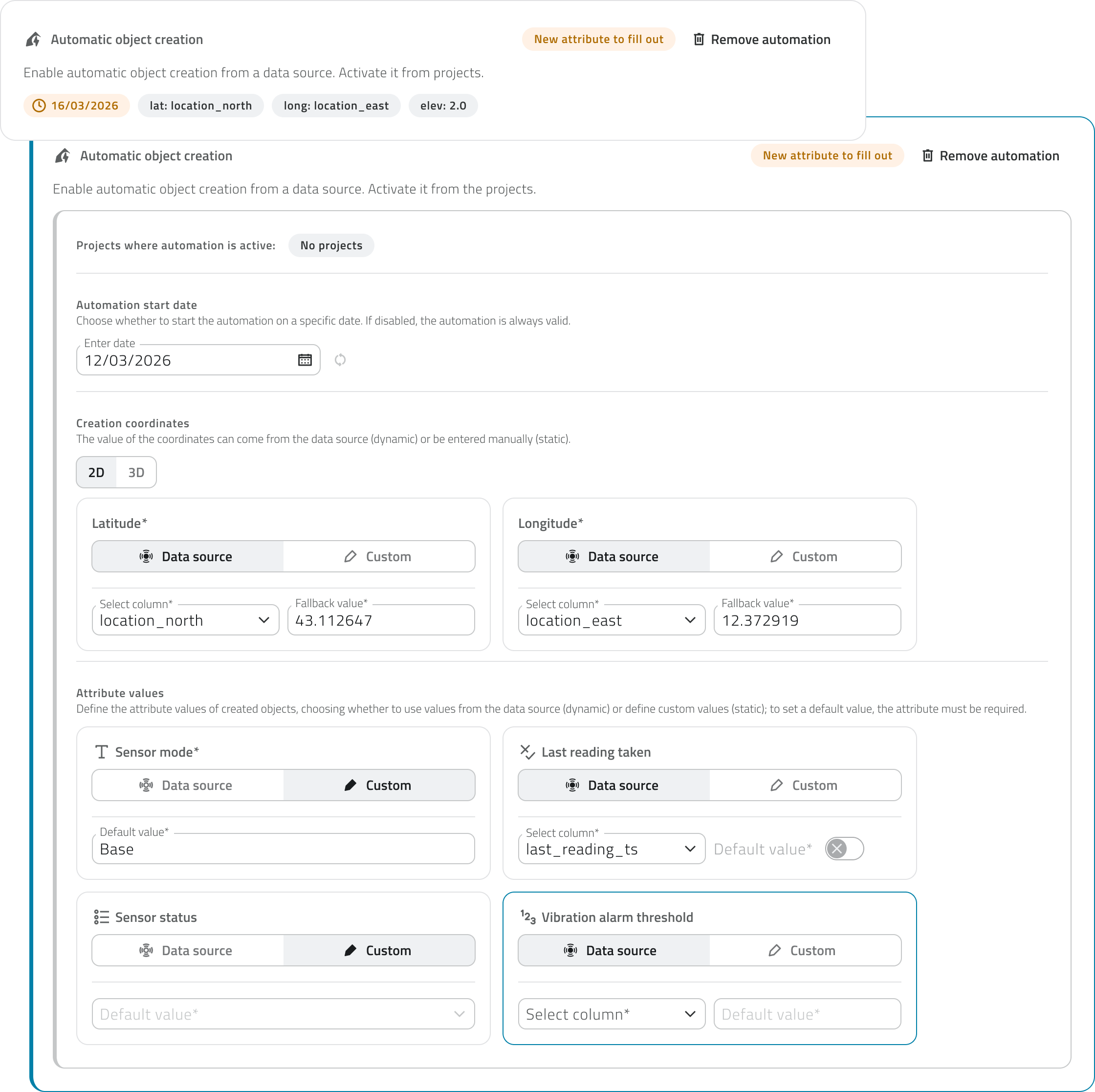
The configuration card can be collapsed by clicking outside of it. When filled out, it displays a summary of the main settings: start date, coordinates, and elevation.

New attributes
If the object class is modified and a new attribute is added after the automation was already configured, the attribute to be filled in is indicated by a label on the card. Clicking on the card opens it, bringing the new attribute into focus, highlighted with a blue border for easy identification. The highlight remains visible until the class is saved or the section is changed.
Removing the automation
To remove the configuration, click the Remove automation button in the top-right corner of the card.

Removing the automation from an object class does not delete the instances already created automatically: the class will simply stop generating new ones. Objects already present in the project will remain unchanged.
Links
Configurare la creazione automatica degli oggetti
La creazione automatica degli oggetti consente alla piattaforma di generare istanze di una classe oggetto a partire dai dati ricevuti da una data source, senza che l'utente debba intervenire manualmente dal progetto.
La creazione automatica è disponibile solo per classi oggetto di tipo Punto e Form. Le classi di tipo Form non hanno la sezione coordinate, quindi viene configurata solo la compilazione degli attributi.
Disponibile solo con sensori configurati in precedenza.
Prerequisiti
La configurazione della creazione automatica è accessibile dalla tab Data Sources nella pagina di creazione o modifica di una classe oggetto, nella sezione Creazione automatica oggetti in fondo alla pagina.
Per sbloccare questa funzione è necessario che nella classe oggetto siano configurati:
- esattamente una data source
- almeno un grafico
Se viene aggiunta più di una data source, il pulsante per aggiungere l'automazione si disabilita. Al contrario, se è già configurata un'automazione, il pulsante per aggiungere ulteriori data source si disabilita.
Modificare la data source associata alla classe oggetto comporta la perdita di tutta la configurazione della creazione automatica degli oggetti.
Aggiungere l'automazione
Clicca sul pulsante + Aggiungi automazione per aprire la scheda di configurazione.
La scheda di configurazione è suddivisa in diverse sezioni.
Progetti dove l'automazione è attiva
Mostra i progetti in cui la creazione automatica è attualmente abilitata. La configurazione viene effettuata nella pagina di configurazione dei progetti nel Backoffice.
Questa sezione è utile in fase di modifica della classe per avere consapevolezza di dove le modifiche andranno a impattare.
Data di avvio automazione
Seleziona la data a partire dalla quale l'automazione deve essere attiva. Il selettore ha come valore predefinito la data odierna, ma è possibile selezionare date passate o future. Se la data viene modificata si abilita il pulsante di reset per tornare alla data corrente.
In modifica della classe oggetto il selettore è in sola visualizzazione se la data selezionata è passata o è il giorno corrente. Se la data è futura può ancora essere modificata.
Coordinate di creazione
Disponibili solo per classi oggetto di tipo Punto.
Definisce le coordinate che verranno utilizzate per posizionare gli oggetti creati automaticamente. I valori possono provenire dalla data source (Data source, dinamico) oppure essere inseriti manualmente (Personalizzato, statico). Per ogni coordinata è obbligatorio indicare un valore di fallback, utilizzato nel caso in cui la data source restituisca un valore nullo.
Tramite le schede 2D e 3D è possibile scegliere se creare gli oggetti in 2D o in 3D. Selezionando 3D viene visualizzato anche il campo Elevazione.
Il valore di fallback viene utilizzato quando la data source restituisce un valore nullo nella colonna selezionata. Serve a garantire che i campi non rimangano vuoti e i dati siano sempre completi. Per le coordinate il campo è sempre obbligatorio
Se per l'elevazione viene selezionato Personalizzato, il valore di fallback corrisponde all'altezza predefinita con cui gli oggetti vengono creati nella piattaforma. Se questo valore viene modificato si abilita il pulsante di reset per tornare al valore originale.
Valori degli attributi
Definisce i valori che verranno assegnati agli attributi degli oggetti creati automaticamente. Per ogni attributo è possibile scegliere se il valore deve provenire dalla data source (Data source, dinamico) oppure essere definito manualmente (Personalizzato, statico).
Gli attributi configurabili da questa sezione sono: testo, numeri, vero/falso, lista valori e data. Gli altri tipi di attributo non sono precompilabili da qui.
L'obbligatorietà della compilazione rispecchia quella definita nella tab Attributi della classe oggetto.
Il valore di fallback viene utilizzato quando la data source restituisce un valore nullo nella colonna selezionata. Corrisponde al valore di default degli attributi ed è abilitato solo se l'attributo è obbligatorio.
Visualizzare la configurazione
La scheda di configurazione può essere collassata cliccando al di fuori di essa. Se compilata mostra un riepilogo delle impostazioni principali: data di avvio, coordinate ed elevazione.
Nuovi attributi
Se la classe oggetto viene modificata e viene aggiunto un nuovo attributo dopo che l'automazione era già configurata, l'attributo da compilare viene segnalato tramite un'etichetta sulla scheda. Cliccando sulla scheda questa si apre mettendo in evidenza il nuovo attributo, evidenziato con un bordo blu per facilitarne l'individuazione. L'evidenziazione rimane visibile fino al salvataggio della classe o al cambio di sezione.
Rimuovere l'automazione
Per rimuovere la configurazione clicca sul pulsante Rimuovi automazione in alto a destra della scheda.
Rimuovere l’automazione da una classe oggetto non elimina le istanze già create automaticamente: la classe smetterà semplicemente di generarne di nuove. Gli oggetti già presenti nel progetto resteranno invariati.
Collegamenti
Last update: 25 May 2026
Create and manage Projects
Creating a new project lets you structure and manage the organisation's operational activities in an orderly way. A project can contain Object classes, Resources, Groups and Sensor sites.
Available only to users with backoffice permission. The elements you want to associate must already exist in the system.
Create a new project
To create a new project, open the Backoffice and click Projects in the left sidebar. The list that opens shows each project's name, last-update date, linked groups and tags.
Click New project in the top-right corner to begin, then fill in the main fields:
- Enter a unique Project name, which is required.
- Click the Tags field to see the tags already saved, then pick one or type a new value. The tag appears inside the field.
- Click a Module to turn it on or off.

Add elements to the project
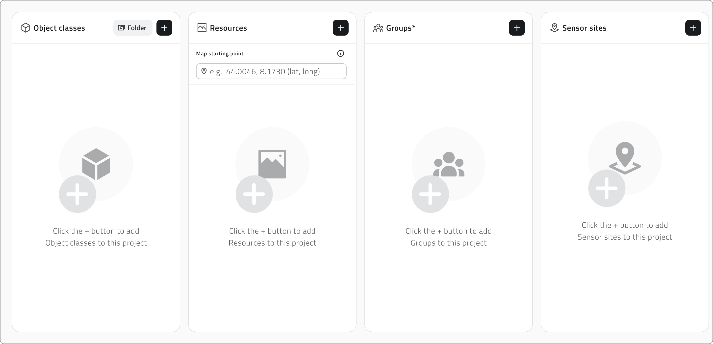
Drag elements from the left list to the right to add them. Hold Ctrl and click to add elements to the selection or remove them, one at a time, or click an element and then Shift-click another to select every element between the two.
As you work, a single search bar filters both lists together, while the counters above each list track how many elements are available and how many are associated. Click Apply to confirm.
Organise object classes
The Object classes panel keeps the two kinds of class apart in separate tabs. Vector holds the Point, Line and Polygon classes that appear in the 2D and 3D views, while Form holds the form-based ones.
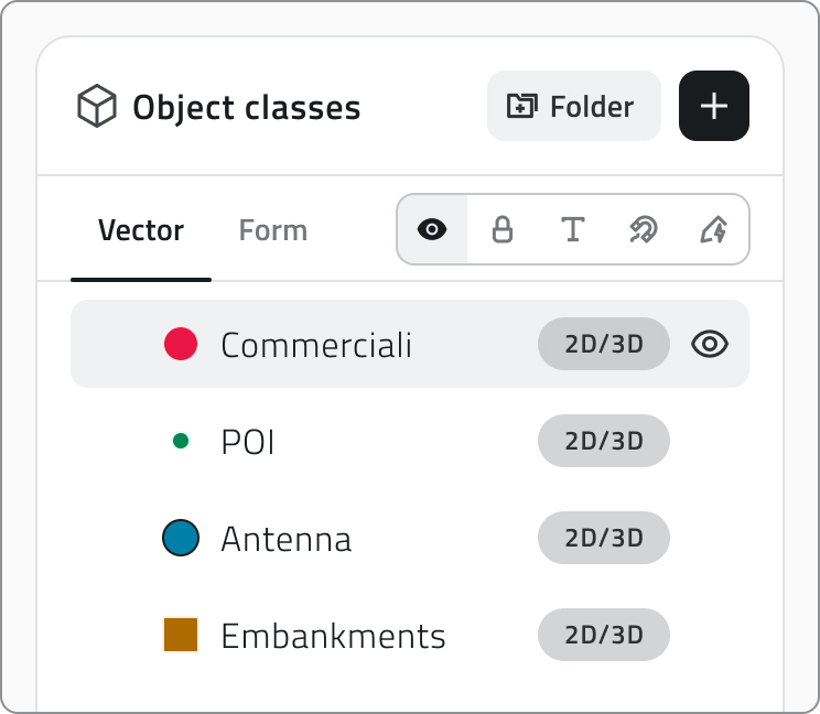
In the Vector tab you arrange the layers as a tree and decide how each one appears when the project opens. Drag a layer to reorder it or to move it into or out of a folder: a blue line follows the cursor to show where it will land, and dropping it onto a folder places it inside.
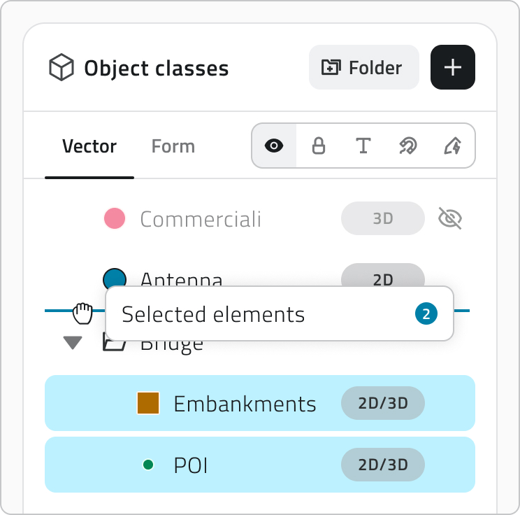
To work on several layers at once, hold Ctrl and click each layer you want to add to or remove from the selection. You can also click one layer and then Shift-click another to select every layer between the two.
- Click the Folder button to create one.
- Double-click a folder name to rename it. A name is required.
- Use the arrow on its left to expand or collapse it, and nest folders on as many levels as you need.
- Hover a folder and choose Ungroup to dissolve it. Its layers move up one level.
- Switch a folder's Visibility to show or hide everything it holds at once, while each layer keeps its own setting.
To set a layer's properties, pick the property in the properties component, then hover the layers to turn it on or off.
| Property | What it sets | Default |
| Visibility | Whether the layer is on or off when the project opens | ON |
| Lock | Whether the layer is protected from user interaction in the viewer | OFF |
| Snap | Whether the layer's geometries work as a snapping reference while drawing or editing | OFF |
| Labels | Whether the layer's labels are shown in the viewer when the project opens | OFF |
| Render Scope | The views the layer belongs to: 2D, 3D or both | BOTH |
Turning on the Mission planner module adds a Mission Planner folder to the Vector tab, holding the object classes needed to use the module. Use the arrow to expand it and see what it contains.
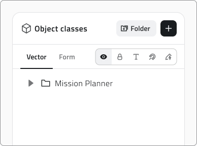
The Mission Planner folder is read-only: the classes it holds cannot be moved or removed.
The Form tab lets you order the form classes and, where a class supports it, set Automatic Object Creation.
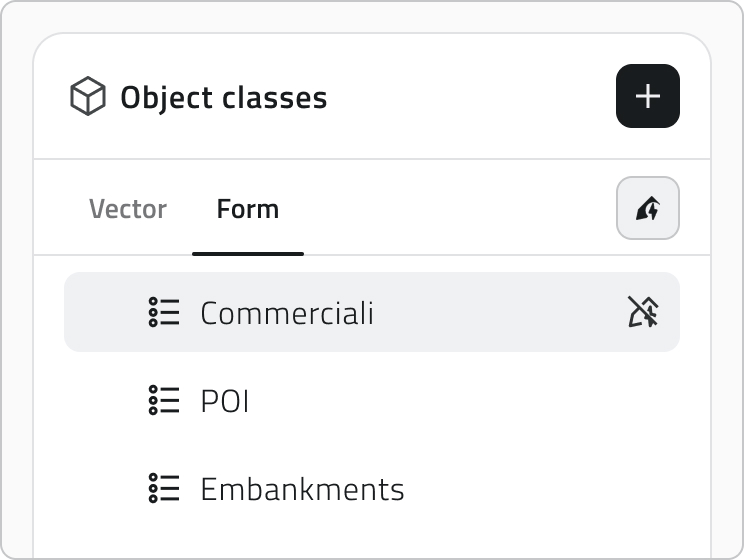
Automatic object creation
Some object classes have automatic object creation configured, and their icon appears next to the name once you add them. Click the icon to enable or disable automatic object creation for this project.

Configure resources and the initial map focus
The Resources panel splits resources between a 2D tab and a 3D tab. Drag them to set the order they appear in the project's side panel, and use Visibility to decide whether each one is active when the project opens.
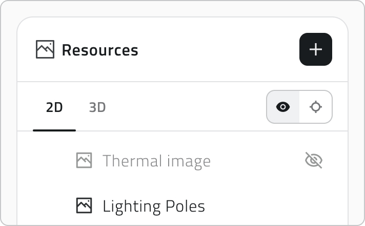
Auto-Center sets what the viewer centres on when the project opens, and you set it separately for each view:
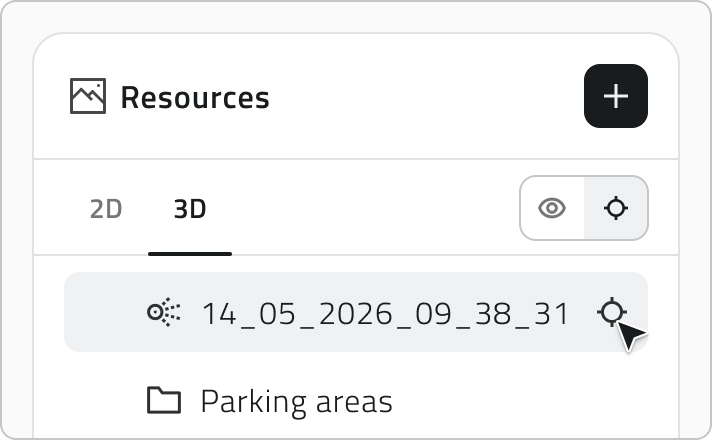
- In the 3D tab, hover a resource and click the crosshair icon to use it as the reference. The crosshair then stays visible on the resource you chose.
- In the 2D tab, enter the geographic coordinates the map should open on.
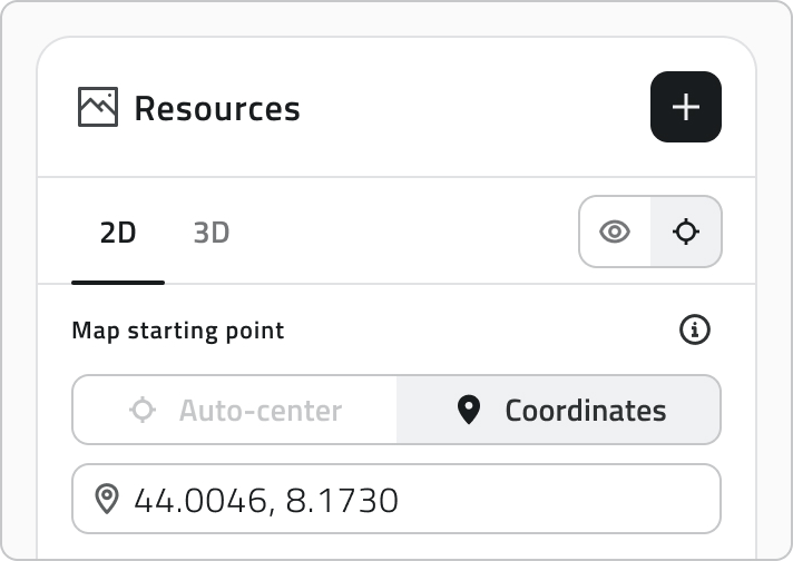
The object class hierarchy, order, visibility, Render Scope, and Auto-Center settings you configure here determine how layers and resources are presented when the project is opened.
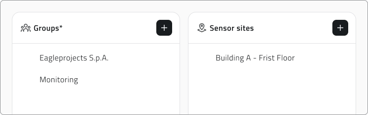
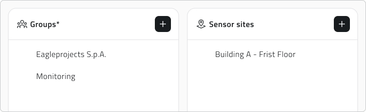
Groups and sensor sites
The Groups panel controls who can reach the project: only the users who belong to an associated group can open it.
The Sensor sites panel associates sets of sensors with the project.
Save the project
Click Save in the top-right corner to save the project. The button stays disabled until you have entered a name and at least one group.

If you remove Object classes that already have created instances, those instances are hidden from the project. A label at the top of the Object classes section keeps this information: hover it to see which classes are hidden.
💡 Tip: Before saving, check that the associated groups are correct: only their members can access the project.
Edit and manage elements
- To edit a project, hover it in the list and click the blue arrow button.
- To duplicate one, select it, click Duplicate and choose which elements to include in the copy.
- To delete projects, select one or more of them, click Delete and type the project name to confirm.
Links
Creare e gestire i progetti
Creare un nuovo progetto permette di strutturare e gestire in modo ordinato le attività operative dell'organizzazione. Un progetto può contenere Classi oggetto, Risorse, Gruppi e Siti sensore.
Disponibile solo per gli utenti con permesso backoffice. Gli elementi da associare devono essere già presenti nel sistema.
Creare un nuovo progetto
Per creare un nuovo progetto, apri il Backoffice e clicca Progetti nella barra laterale sinistra. La lista che si apre mostra nome, data dell'ultima modifica, gruppi collegati e tag di ciascun progetto.
Clicca Nuovo progetto in alto a destra per iniziare, poi compila i campi principali:
- Inserisci un Nome univoco, che è obbligatorio.
- Clicca nel campo Tag progetto per vedere i tag già salvati, poi scegline uno o digitane uno nuovo. Il tag comparirà dentro il campo.
- Clicca un Modulo per attivarlo o disattivarlo.

💡 Suggerimento: I tag classificano i progetti e ne facilitano la ricerca. Quelli che crei vengono salvati e riproposti nei progetti futuri.
Aggiungere elementi al progetto
Il pulsante Aggiungi presente in ogni sezione apre il relativo pannello di selezione.
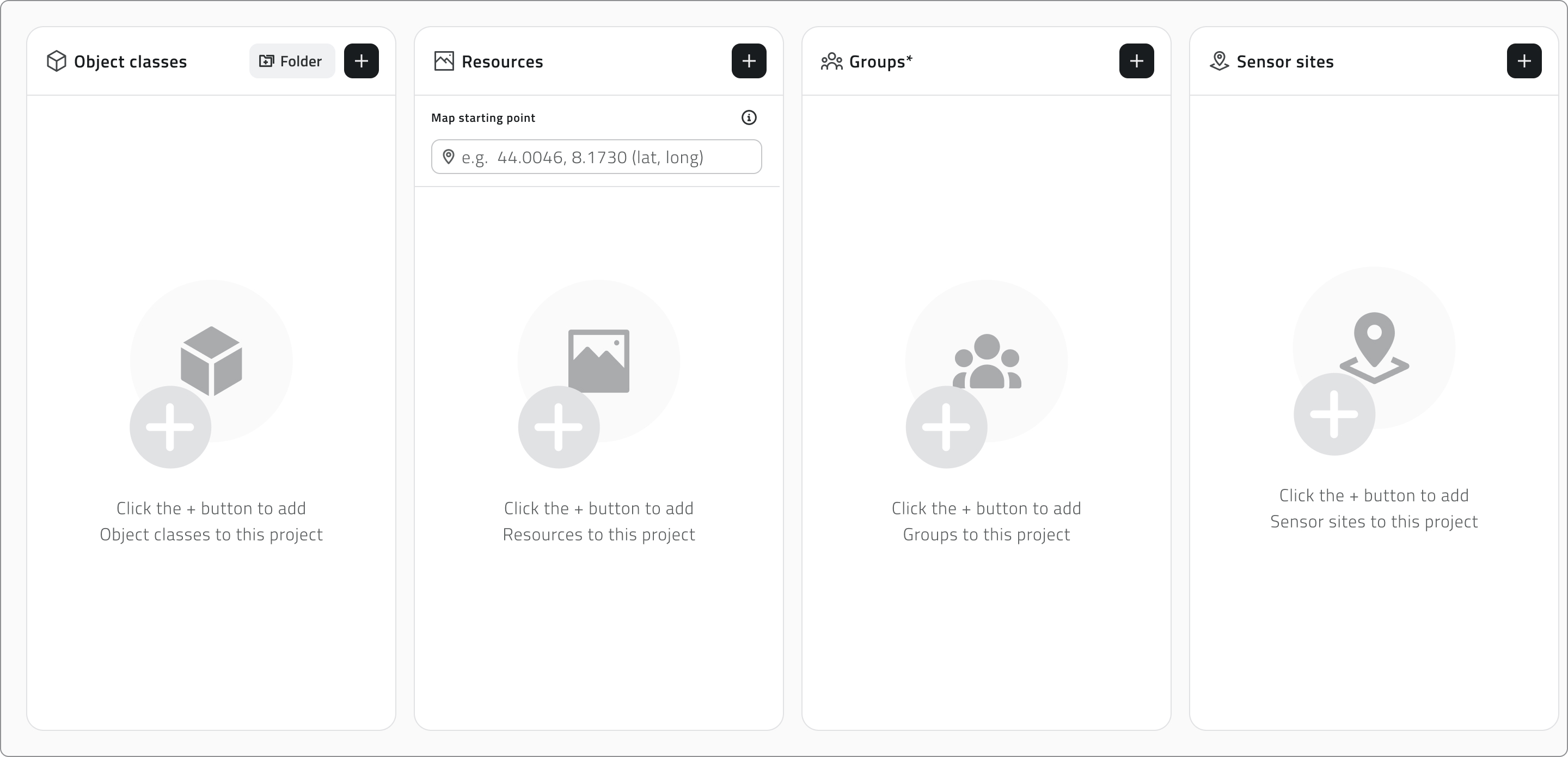
Trascina gli elementi dalla lista di sinistra a quella di destra per aggiungerli. Tieni premuto Ctrl e clicca per aggiungerli alla selezione o toglierli, uno alla volta, oppure clicca un elemento e poi fai Shift+clic su un altro per selezionare tutti gli elementi compresi tra i due.
Mentre lavori, un'unica barra di ricerca filtra entrambe le liste, mentre i contatori sopra ciascuna lista tengono traccia di quanti elementi sono disponibili e quanti associati. Clicca Applica per confermare.
Organizzare le classi oggetto
Il pannello Classi oggetto mantiene distinti i due tipi di classe in tab separate. Vettoriale raccoglie le classi Punto, Linea e Poligono che compaiono nelle viste 2D e 3D, mentre Form raccoglie quelle di tipo Form.
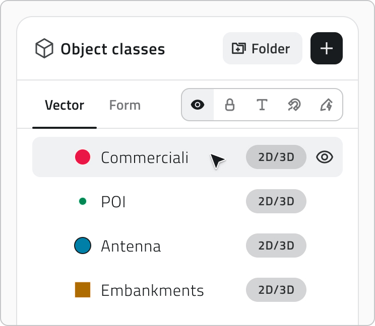
Nella tab Vettoriale disponi i layer ad albero e decidi come ciascuno si presenta all'apertura del progetto. Trascina un layer per riordinarlo o per spostarlo dentro o fuori da una cartella: una linea blu segue il cursore e mostra dove verrà collocato, e rilasciandolo su una cartella lo inserisci al suo interno.
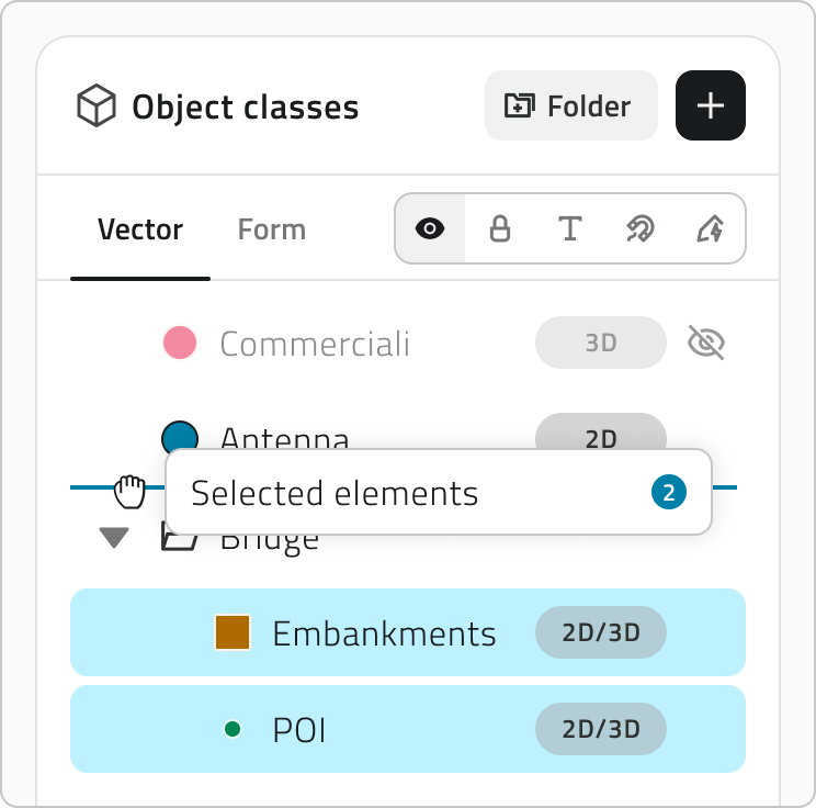
Per lavorare su più layer insieme, tieni premuto Ctrl e clicca ogni layer che vuoi aggiungere o togliere dalla selezione. In alternativa, clicca un layer e poi fai Shift+clic su un altro per selezionare tutti i layer compresi tra i due.
Le cartelle servono a tenere insieme i layer correlati:
- Clicca il pulsante Cartella per crearne una.
- Fai doppio clic sul nome di una cartella per rinominarla. Il nome è obbligatorio.
- Usa la freccia a sinistra per espanderla o comprimerla, e annida le cartelle su quanti livelli ti servono.
- Passa il mouse su una cartella e scegli Separa per scioglierla. I suoi layer salgono di un livello.
- Cambia la visibilità di una cartella per mostrare o nascondere in blocco tutto ciò che contiene, mentre ogni layer conserva la propria impostazione.
Per impostare le proprietà di un layer, scegli la proprietà e passa il mouse sui layer per attivarla o disattivarla.
| Proprietà | Cosa imposta | Default |
| Visibilità | Se il layer è acceso o spento all'apertura del progetto | ON |
| Blocco | Se il layer è protetto dalle interazioni dell'utente nel viewer | OFF |
| Snap | Se le geometrie del layer funzionano da riferimento di aggancio durante disegno ed editing | OFF |
| Etichette | Se le etichette del layer sono mostrate nel viewer all'apertura del progetto | OFF |
| Render Scope | Le viste a cui appartiene il layer: 2D, 3D o entrambe | 2D e 3D |
Attivando il modulo Mission planner, nella tab Vector compare la cartella Mission Planner con le classi oggetto necessarie all'utilizzo del modulo. Usa la freccia per espanderla e vederne il contenuto.
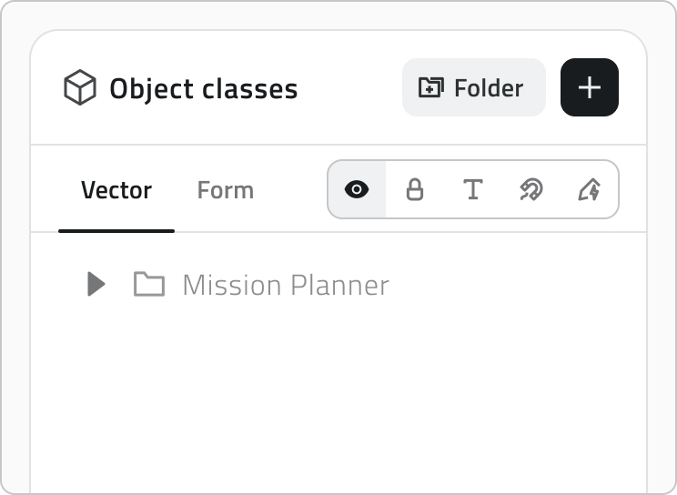
La cartella Mission Planner è in sola lettura: le classi che contiene non si possono spostare né rimuovere.
La tab Form permette di ordinare le classi form e, dove la classe lo supporta, di impostare la Creazione automatica degli oggetti.
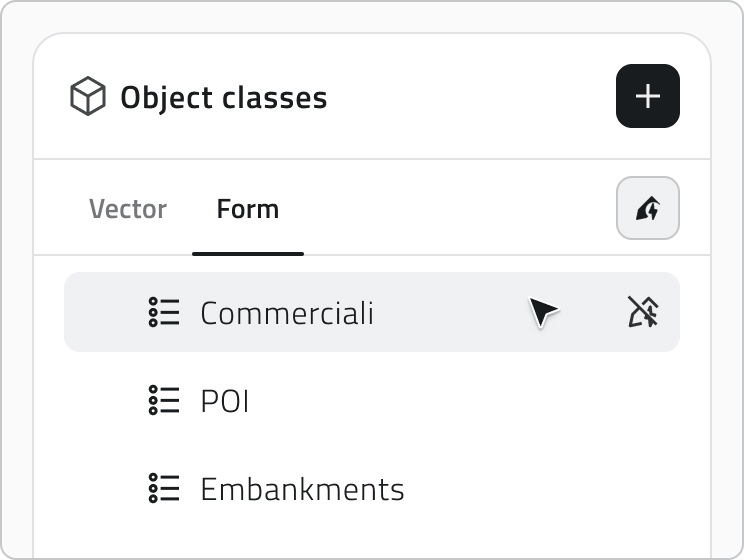
Creazione automatica degli oggetti
Alcune classi oggetto hanno la creazione automatica degli oggetti configurata e, quando le aggiungi, la relativa icona compare accanto al nome. Clicca l'icona per attivare o disattivare la creazione automatica per questo progetto.
Configurare le risorse e il focus iniziale della mappa
Il pannello Risorse divide le risorse tra una tab 2D e una tab 3D. Trascinale per definire l'ordine con cui appaiono nel pannello laterale del progetto e usa la visibility mode per decidere se ciascuna è attiva all'apertura.
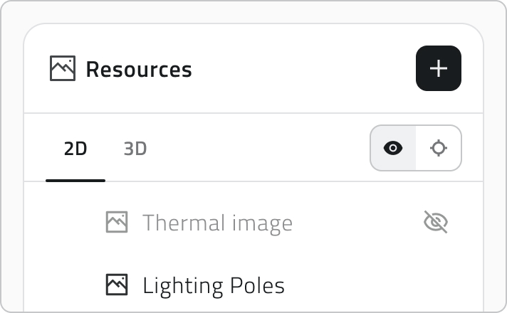
L'Auto-Center definisce su cosa si centra il viewer all'apertura del progetto e si imposta separatamente per ciascuna vista:
- Nella tab 3D, passa il mouse su una risorsa e clicca l'icona a mirino per usarla come riferimento. Il mirino resta poi visibile sulla risorsa scelta.
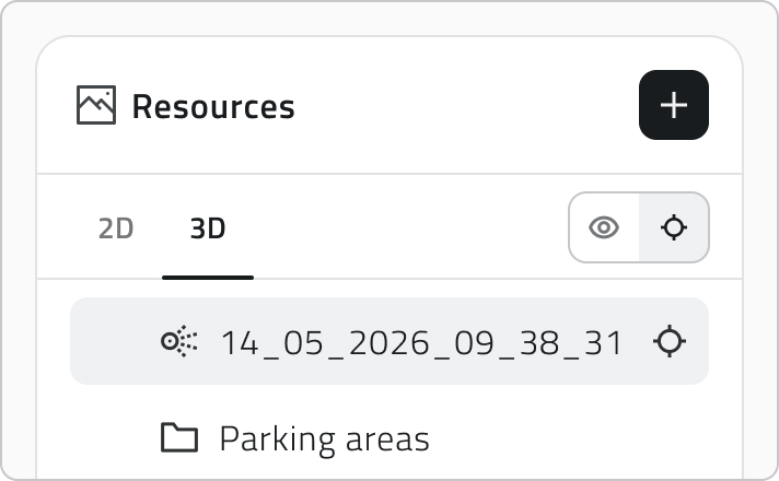
- Nella tab 2D, inserisci le coordinate geografiche su cui deve aprirsi la mappa.
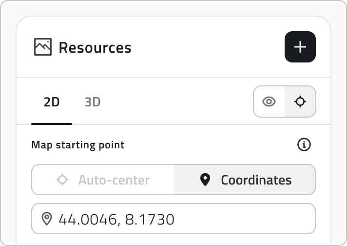
L'alberatura delle classi oggetto, l'ordine, la visibilità, il Render Scope e l'Auto-Center che imposti qui definiscono come layer e risorse si presentano all'apertura del progetto.
Groups e sensor sites
Il pannello Gruppi regola chi può raggiungere il progetto: solo gli utenti che fanno parte di un gruppo associato possono aprirlo.
Il pannello Siti sensore associa al progetto insiemi di sensori.
Salvare il progetto
Clicca Salva in alto a destra per salvare il progetto. Il pulsante resta disabilitato finché non hai inserito un nome e almeno un gruppo.

Se rimuovi Object classes che hanno già istanze create, queste vengono nascoste dal progetto. Un'etichetta in cima alla sezione Object classes conserva l'informazione: passaci sopra per vedere quali classi sono nascoste.
💡 Suggerimento: Prima di salvare, controlla che i gruppi associati siano corretti: solo i loro membri potranno accedere al progetto.
Modificare e gestire elementi
- Per modificare un progetto, passa il mouse sulla sua riga nella lista e clicca il pulsante blu con la freccia.
- Per duplicarlo, selezionalo, clicca Duplica e scegli quali elementi includere nella copia.
- Per eliminare uno o più progetti, selezionali, clicca Elimina e scrivi il nome del progetto per confermare.
Collegamenti
Last update: 6 July 2026
Create and manage Roles
A Role defines permissions (edit, view, access) for object classes and resources. It is used to precisely configure the permissions assigned to associated groups.
Available only to users with backoffice permission.
Permission Levels
Permissions apply to Object Classes and Reports.
| Permission Type | Icon | Description |
| Hidden | 👁️🗨️ (crossed-out eye) | Users with this role cannot see the element. |
| Visible | 👁️ (open eye) | Users with this role can see the element, but cannot edit it. |
| Editable | ✏️ (pencil) | Users with this role can view and edit the element. |
Steps: Creation and Configuration
1. Access the Backoffice and click Roles on the left-side menu.
The list shows the name, creation date, number of associated groups and permission count for object classes.

2. Click the New Role button in the top-right corner.
3. Enter the role name (required) in the Role Name field.
4. Select and Edit Permissions.
The lists show all available items for the three categories. By default, items retain the permission assigned to them at the time of creation.
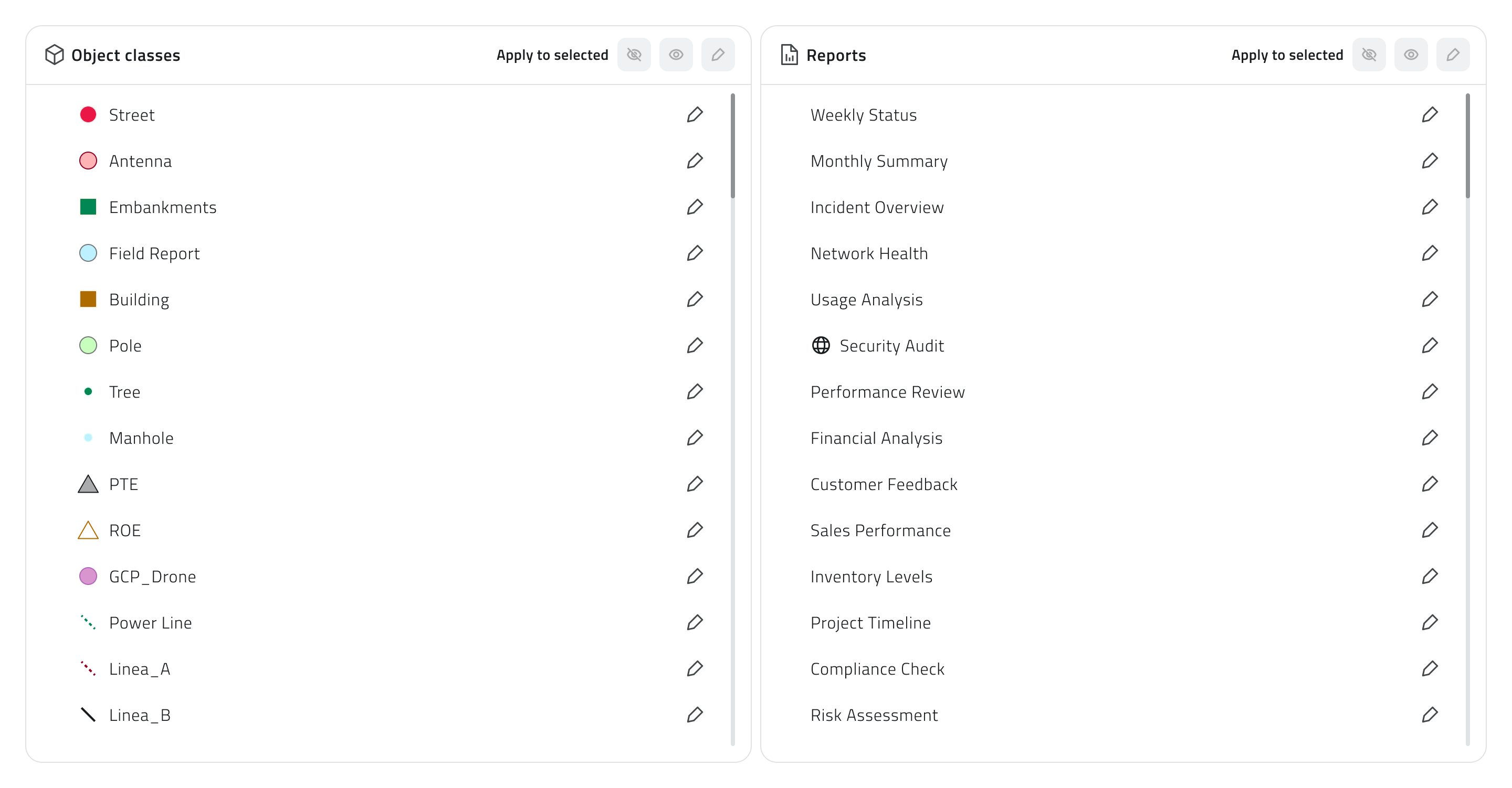
You can filter items using the search bar and the chips at the top right of the page.

To assign permissions, select one or more items using the Control or Shift keys, then click one of the three buttons at the top right of the list: Hidden, Visible, or Editable. Hold Control and click an item that is already selected to remove it from the selection.
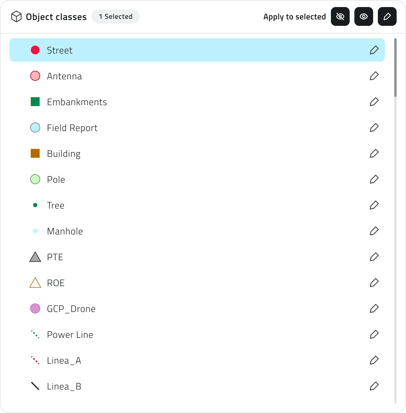
5. Save the new role by clicking Save in the upper-right corner. You will be redirected to the list of roles.
💡Tip: Use the chips to quickly find items with specific permissions.
💡Tip: To see which groups are associated with a role, hover over the number of groups in the Roles list. The complete list of associated groups will be displayed.
Viewing and Editing Roles
To edit a role, click the blue button with the arrow icon that appears when you hover over the item.
To duplicate a role, select an item from the list. Once selected, the Duplicate button will appear.
To delete a role, select one or more items from the list. Once selected, the Delete button will appear.
Links
Creare e gestire i ruoli
Un Ruolo definisce i permessi (modifica, visualizzazione, accesso) sulle classi oggetto e sui report. Serve per impostare con precisione i permessi assegnati ai gruppi associati.
Disponibile solo per utenti con permesso backoffice.
Livelli di Permesso
I permessi si applicano a Classi Oggetto e Report.
| Tipo di Permesso | Icona | Descrizione |
| Non visibile | 👁️🗨️ (occhio barrato) | Gli utenti del ruolo non vedono l'elemento. |
| Visibile | 👁️ (occhio aperto) | Gli utenti del ruolo vedono l'elemento, ma non possono modificarlo. |
| Modificabile | ✏️ (matita) | Gli utenti del ruolo possono visualizzare e modificare l'elemento. |
Passaggi: Creazione e Configurazione
1. Accedi al Backoffice e clicca su Ruoli nel menu laterale sinistro. La lista mostra nome, data di creazione, numero di gruppi associati e il conteggio dei permessi per le classi oggetto.

2. Clicca sul pulsante Nuovo ruolo in alto a destra.

3. Inserisci il nome del ruolo (obbligatorio) nel campo Nome Ruolo.
4. Seleziona e Modifica Permessi.
Le liste mostrano tutti gli elementi disponibili per le tre categorie. Per impostazione predefinita, gli elementi mantengono il permesso assegnato al momento della loro creazione.
Puoi filtrare gli elementi con la barra di ricerca e i filtri rapidi situate in alto a destra della pagina.
Per assegnare i permessi seleziona uno o più elementi, usando Control o Shift, quindi clicca su uno dei tre bottoni disponibili in alto a destra della lista: Non visibile, Visibile o Modificabile. Con Control + clic su un elemento già selezionato lo togli dalla selezione.
5. Salva il nuovo ruolo cliccando Salva in alto a destra. Verrai reindirizzato alla lista dei ruoli.
💡Suggerimento: Utilizza le chip per trovare rapidamente elementi con permessi specifici.
💡Suggerimento: Per vedere quali gruppi sono associati a un ruolo, passa il mouse sul numero dei gruppi nella lista Ruoli. Viene mostrato l’elenco completo dei gruppi collegati.
Visualizzazione e Modifica dei Ruoli
Per modificare un ruolo, clicca sul pulsante blu con l'icona di una freccia, che appare al passaggio del mouse sull'elemento.
Per duplicare un ruolo, seleziona un elemento dalla lista. Dopo la selezione, compare il pulsante Duplica.
Per eliminare un ruolo, seleziona uno o più elementi dalla lista. Dopo la selezione, compare il pulsante Elimina.
Collegamenti
Last update: 07 May 2026
Create and manage Groups
A group brings together users with the same role and permissions, allowing them to work on the same projects using a consistent set of operations.
Creating a group allows you to group users and assign them a role, simplifying permission management in a scalable way.
Available only to users with backoffice permissions. To create a group, the role to which the group will be linked must already exist in the system.
Steps
1. Access the Backoffice and click Groups in the left-side menu.
The list shows the name, creation date, associated projects, added users and linked role.

2. Click the New Group button in the top-right corner.

3. Fill in the required fields (name and role):
- Enter a unique name in the Group Name field.
- Select the Role to associate from the drop-down menu.

Name and Role are required to save.
4. Add or remove users.
The group configuration shows two lists: on the left are all users in the organization, while on the right are the users already added to the group.
To add users to the group, select one or more names from the list on the left using Control or Shift for multiple selection, then drag them to the area on the right. Hold Control and click a name that is already selected to remove it from the selection.
To remove users from the group, select the names from the list on the right and drag them to the list on the left. To remove all added users, click Clear.
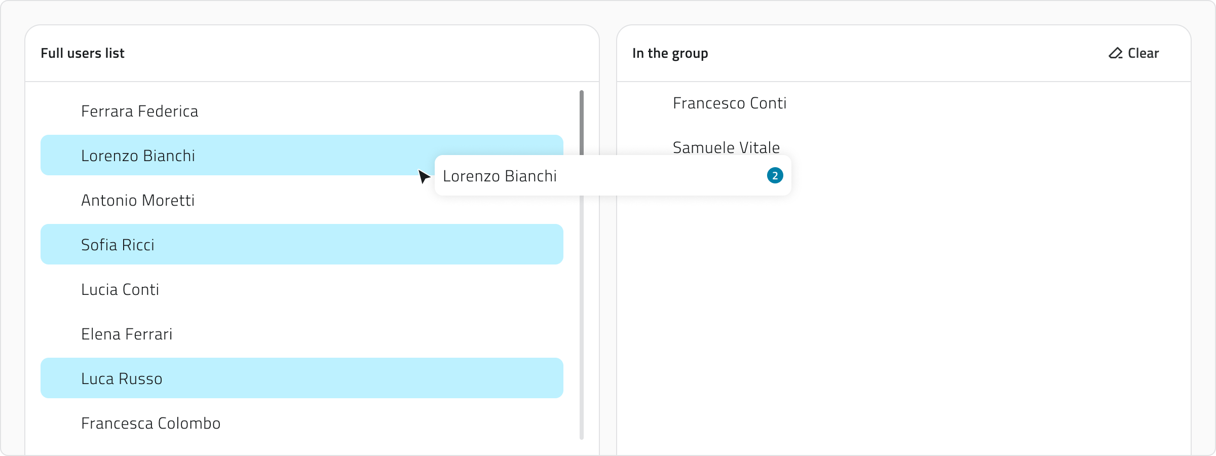
5. Save the new group by clicking Save in the top-right corner (after assigning at least one user).
💡Tip: Use the search bar to filter users in both lists.
💡Tip: Make sure to assign only those users who need the same level of access to the projects.
Viewing and Editing Groups
To edit a group, click the blue button with the arrow icon that appears when you hover over the item.
To duplicate a group, select an item from the list. Once selected, the Duplicate button will appear.
Links
Crea e gestisci i gruppi
Un gruppo raccoglie utenti con lo stesso ruolo e permessi, consentendo loro di lavorare sugli stessi progetti con un set di operazioni coerenti.
Creare un gruppo serve a associare utenti e assegnare loro un ruolo, semplificando la gestione dei permessi in modo scalabile.
Disponibile solo per utenti con permesso backoffice. Per creare un gruppo è necessario che nel sistema sia già presente il ruolo a cui il gruppo deve essere collegato.
Passaggi
1. Accedi al Backoffice e clicca su Gruppi nel menu sul lato sinistro.
La lista mostra nome, data di creazione, progetti associati, utenti aggiunti e il ruolo collegato.
2. Clicca sul pulsante Nuovo gruppo in alto a destra.
3. Compila i campi obbligatori (nome e ruolo):
- Inserisci un nome univoco nel campo Nome gruppo.
- Seleziona il Ruolo da associare tramite il menu a tendina.
Nome e Ruolo sono obbligatori per il salvataggio.
4. Aggiungi o rimuovi gli utenti.
La configurazione del gruppo mostra due liste: a sinistra sono disponibili tutti gli utenti dell’organizzazione, mentre a destra sono presenti gli utenti già aggiunti al gruppo.
Per aggiungere utenti al gruppo, seleziona uno o più nominativi dalla lista a sinistra usando Control o Shift per le selezioni multiple, quindi trascinali nell’area a destra. Con Control + clic su un nominativo già selezionato lo togli dalla selezione.
Per rimuovere utenti dal gruppo, seleziona i nominativi dalla lista a destra e trascinali nella lista a sinistra. Per rimuovere tutti gli utenti aggiunti, clicca Cancella.
5. Salva il nuovo gruppo cliccando Salva in alto a destra (dopo aver assegnato almeno un utente).
💡Suggerimento: Usa la barra di ricerca per filtrare gli utenti in entrambe le liste.
💡Suggerimento: Assicurati di assegnare solo gli utenti che devono avere lo stesso livello di accesso ai progetti.
Visualizzazione e Modifica dei Gruppi
Per modificare un gruppo, clicca sul pulsante blu con l’icona di una freccia, che appare al passaggio del mouse sull’elemento.
Per duplicare un gruppo, seleziona un elemento dalla lista. Dopo la selezione, compare il pulsante Duplica.
Collegamenti
Last update: 07 May 2026
Create and manage Events
An Event allows the platform to receive and interpret information (typically JSON) from external providers, linking it to a platform entity such as organizations, projects, objects, sensors, and devices.
To use events for sending notifications, you can configure the outputs from the Automations section.
Available only to users with backoffice permission. To create an event, the entities it must be linked to must already exist in the system: project, object, sensor, or device.
Create a new Event
1. Log in to the Backoffice and open the Events section from the left-side menu.
The list shows the name, the linked entity, the linked automation, the creation date,and a button to copy the event URL.

2. Click New event in the top-right corner.

3. Enter the Event name and select the Linked to entity, both fields are required.
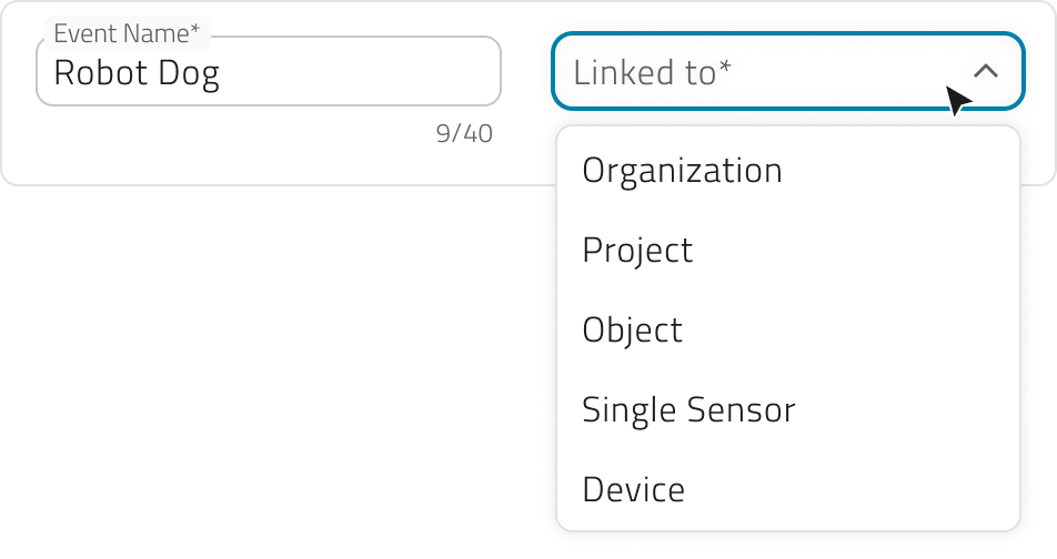
The available options are:
- Organization
For general events. - Project
For events specific to a single project. - Object
For events linked to a class and a single instance. - Single sensor
For events coming from a single sensor. - Device
For events generated by a set of sensors.
4. In the Mapping section, define how the incoming data should be interpreted.
If needed, load the sample payload: paste or upload a JSON file in the text box and click Confirm to generate the mapping keys.
Loading the JSON is not required, you can also fill in the fields manually.
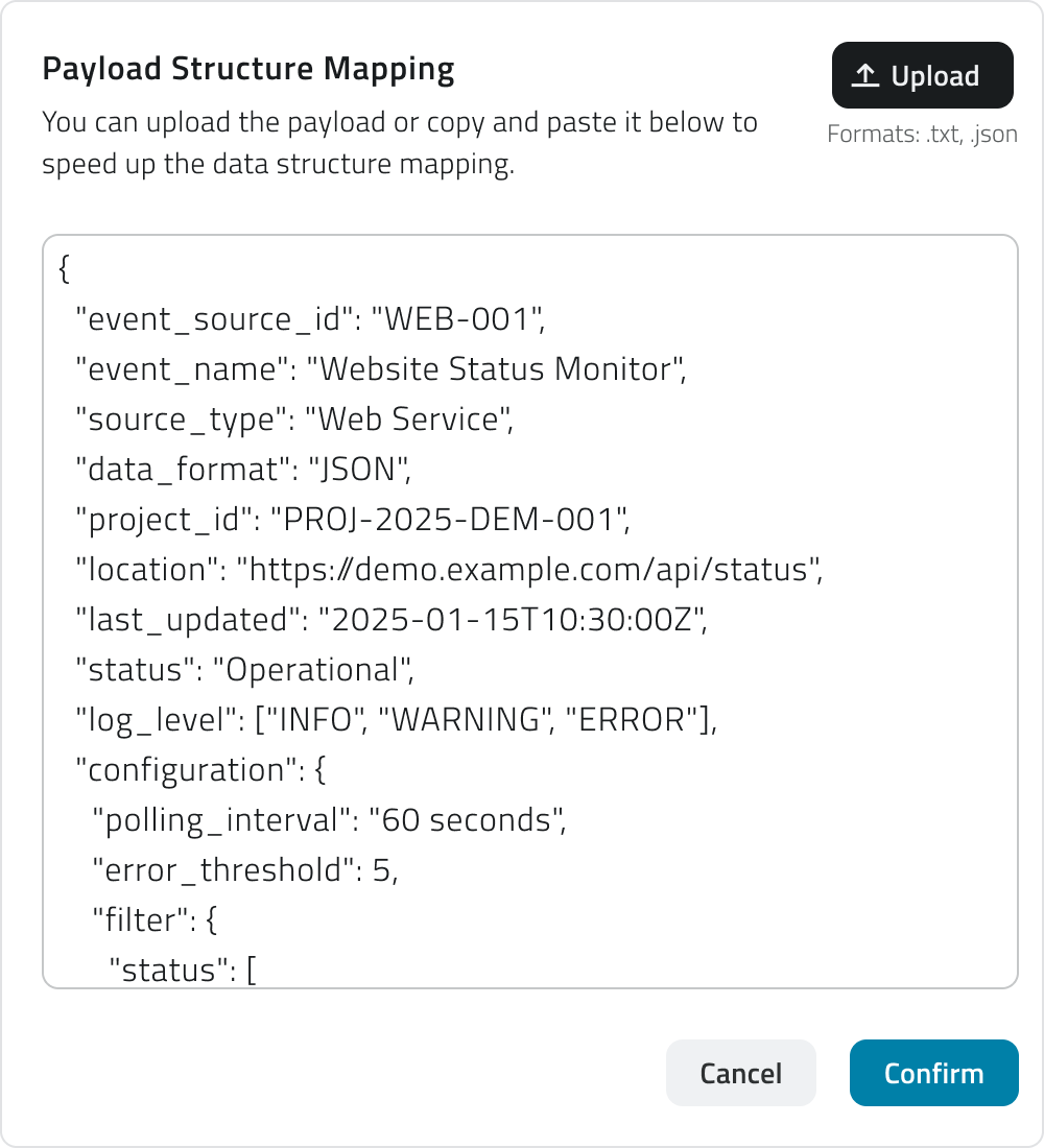
Then map the keys, associating the provider's keys with the fields required by the platform:
- Name (required)
The name of the event. Example:event_nameornotification_name. - Event ID (required)
Uniquely identifies the type of event. Example:event_idortype_code. - Time (required)
Indicates when the event occurs. Example:timestamporevent_time. - Levels (required)
Defines the type or severity of the event (info,warning,success,error). Each level can have a Displayed name, shown when hovering over the level icon. Example: a key likeseverityorstatusmapped to "warning". - Description (required)
Briefly explains the content or purpose of the event. Example:messageordetails. - Additional info (optional)
Adds supplementary data, each with an optional Displayed name. Example:temperature,battery_status,signal_strength.
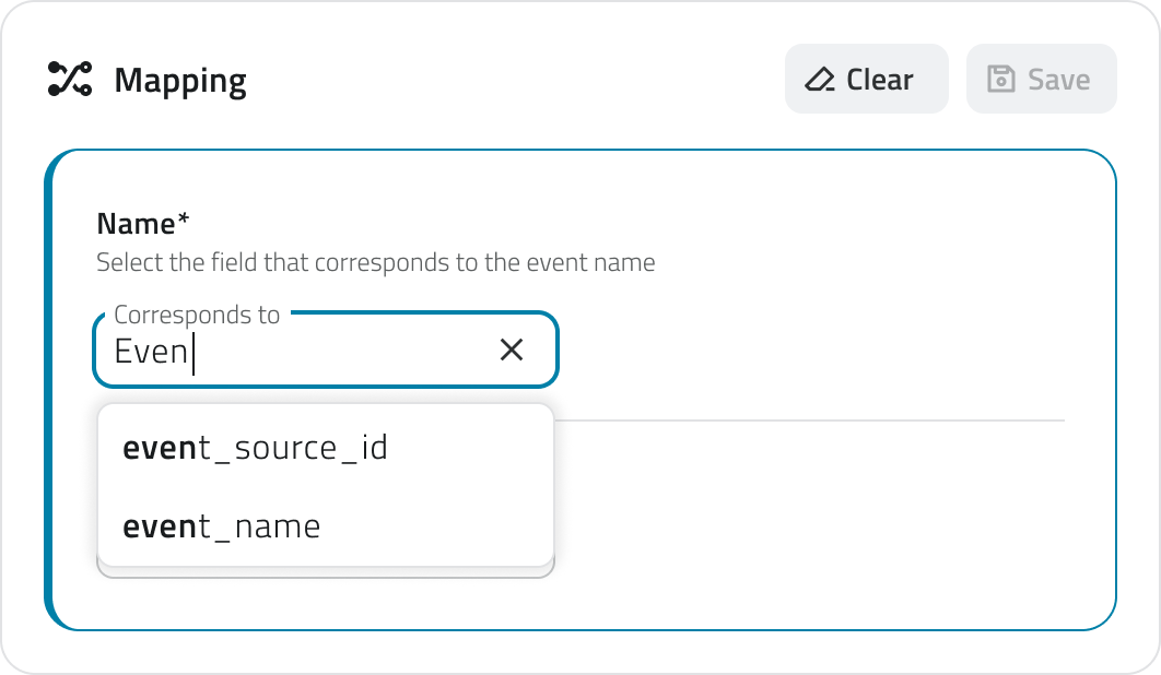
Depending on the linked entity selected earlier, additional required fields may appear:
- Project ID
Links the event to a project. Example:project_id. - Object ID
Links the event to an object; the object class must be selected first. Example:object_idorentity_ref. - Single Sensor ID
Identifies the sensor the event comes from. Example:sensor_idorsensor_name. - Device ID
Identifies the device grouping one or more sensors. Example:device_idorcontroller_name.
For each mapped key it is also possible to assign a type, which defines how the platform should interpret that value.
The available types are:
- Text field: for text values.
- Date: selectable as date only or date and time.
- Number: selectable as integer or decimal number.
- True/false: for boolean values.
The type assigned to each field influences the conditions available in the Automations section.
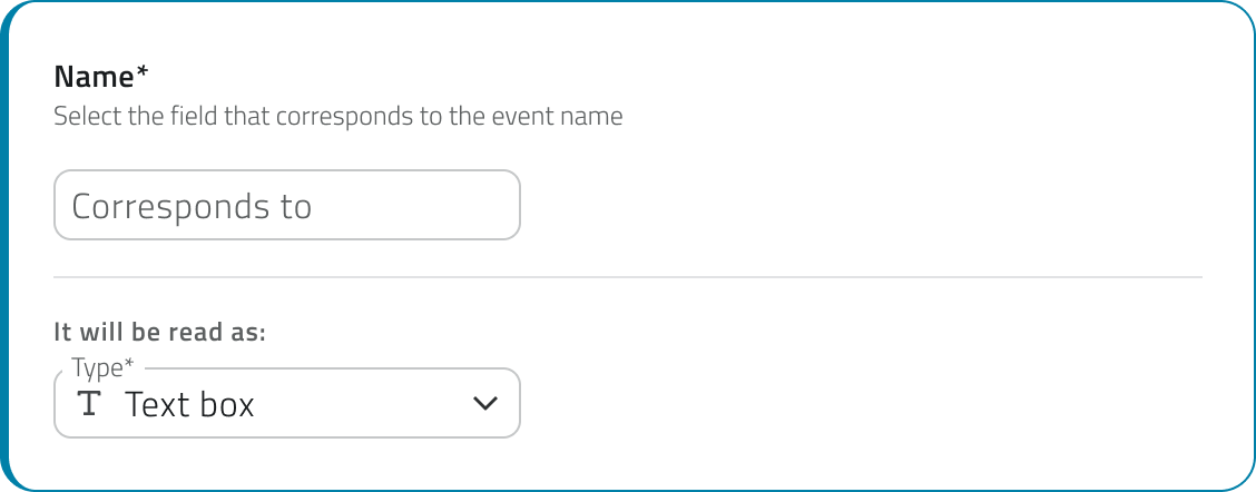
5. If the payload includes geographic data, it is possible to map the coordinates as well. Enable the switch to configure how the platform should read the incoming coordinates.
Once enabled, you can choose the format in which the coordinates are transmitted by the provider:
- Single field
The coordinates are contained in a single field of the payload. Enter the field name in Corresponds to. - Double field
Latitude and longitude are transmitted in separate fields. Enter the respective names in the Latitude corresponds to and Longitude corresponds to fields.
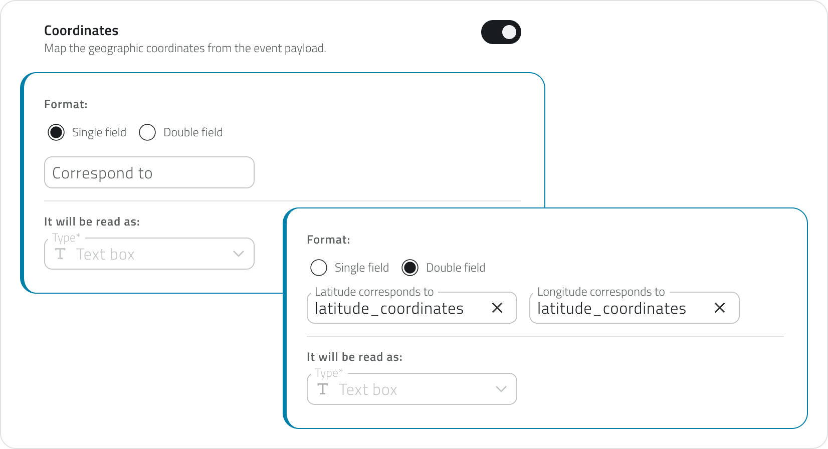
The Coordinates field is required to enable certain actions in Automations, such as the creation of an object of type Point or the launch of a robotic mission.
6. Click Save in the top-right corner. The button remains disabled until the name, the linked entity, and all required keys have been filled in.
Once saved, a URL link appears in the list. This link must be provided to the external provider to enable data transmission.
Edit and manage events
To edit an event, click the blue button with the arrow icon that appears when hovering over the item.
To duplicate an event, select a single item from the list, then click the Duplicate button in the top-right corner.
To delete an event, select one or more items from the list, the Delete button will appear in the top-right corner. Hold CTRL and click to add items to the selection or remove them from it.
To copy the URL of an event, use the dedicated button directly from the list.
💡 Tips:
- When duplicating an event, update the mapping keys if the target provider uses a different JSON structure.
- Use descriptive names for events to make them easier to identify in the list.
Links
Crea e gestisci eventi
Un Evento consente alla piattaforma di ricevere e interpretare informazioni (tipicamente JSON) da provider esterni, collegandole a un'entità della piattaforma, come organizzazioni, progetti, oggetti, sensori e dispositivi.
Per usare gli eventi per l'invio di notifiche, puoi configurare gli output dalla sezione Automazioni.
Disponibile solo per utenti con permesso backoffice. Per creare un evento è necessario che nel sistema siano già presenti le entità a cui l’evento deve essere collegato: progetto, oggetto, sensore o dispositivo.
Creare un nuovo evento
1. Accedi al Backoffice e apri la sezione Eventi dal menu laterale sinistro.
La lista mostra il nome, l'entità collegata, l'automazione collegata, la data di creazione e un bottone per copiare l'URL dell'evento.
2. Clicca su Nuovo evento in alto a destra.
3. Inserisci il Nome evento e seleziona l'Entità collegata, entrambi i campi sono obbligatori.
Le opzioni disponibili sono:
- Organizzazione
Per eventi generali. - Progetto
Per eventi specifici di un singolo progetto. - Oggetto
Per eventi legati a una classe e a una singola istanza. - Sensore singolo
Per eventi provenienti da un singolo sensore. - Dispositivo
Per eventi generati da un insieme di sensori.
4. Nella sezione Mapping definisci come i dati in arrivo devono essere interpretati.
Se lo ritieni necessario, carica il payload di esempio: incolla o carica un file JSON nella casella di testo e clicca Conferma per generare le chiavi di mappatura.
Inserire il JSON non è obbligatorio, puoi inserire i campi anche manualmente.
Poi mappa le chiavi, associando le chiavi del provider ai campi richiesti dalla piattaforma:
- Nome (obbligatorio)
Il nome dell'evento. Esempio:event_nameonotification_name. - Event ID (obbligatorio)
Identifica in modo univoco il tipo di evento. Esempio:event_idotype_code. - Tempo (obbligatorio)
Indica il momento in cui l'evento si verifica. Esempio:timestampoevent_time. - Livelli (obbligatorio)
Definisce la tipologia o gravità dell'evento (info,warning,success,error).
Ogni livello può avere un Nome visualizzato, visibile passando il cursore sull'icona del livello. Esempio: una chiave comeseverityostatusmappata su "warning". - Descrizione (obbligatoria)
Spiega brevemente il contenuto o lo scopo dell'evento. Esempio:messageodetails. - Informazioni aggiuntive (facoltativo)
Aggiunge dati supplementari, ciascuno con un Nome visualizzato opzionale. Esempio:temperature,battery_status,signal_strength.
In base all'entità colegata selezionata precedentemente, potrebbero aggiungersi ulteriori campi obbligatori:
-
Project ID
Collega l'evento a un progetto. Esempio:project_id. -
Object ID
Collega l'evento a un oggetto; è necessario selezionare prima la classe oggetto. Esempio:object_idoentity_ref. -
Single Sensor ID
Identifica il sensore da cui proviene l'evento. Esempio:sensor_idosensor_name. -
Device ID
Identifica il dispositivo che raggruppa uno o più sensori. Esempio:device_idocontroller_name.
Per ogni chiave mappata è inoltre possibile assegnare una tipologia, che definisce come la piattaforma deve interpretare quel valore.
Le tipologie disponibili sono:
- Campo di testo: per valori testuali.
- Data: selezionabile come solo data o come data e ora.
- Numero: selezionabile come numero intero o numero reale.
- Vero/falso: per valori booleani.
La tipologia assegnata a ciascun campo influenza le condizioni disponibili nella sezione Automazioni.
5. Se il payload include dati geografici, è possibile mappare anche le coordinate. Attiva lo switch per configurare come la piattaforma deve leggere le coordinate in arrivo.
Una volta attivato, puoi scegliere il formato con cui le coordinate vengono trasmesse dal provider:
- Campo singolo
Le coordinate sono contenute in un unico campo del payload. Inserisci il nome del campo in Corrisponde a. - Doppio campo
Latitudine e longitudine sono trasmesse in campi separati. Inserisci i rispettivi nomi nei campi Latitudine corrisponde a e Longitudine corrisponde a.
Il campo Coordinate è necessario per abilitare alcune azioni nelle Automazioni, come la creazione di un oggetto di tipo Punto o l'avvio di una missione robotica.
6. Per salvare, clicca Salva in alto a destra. Il bottone rimane disabilitato finché non sono compilati il nome, l'entità collegata e tutte le chiavi obbligatorie.
Una volta salvato, nella lista compare un link URL che deve essere fornito al provider esterno per abilitare l'invio dei dati.
Modificare e gestire gli eventi
Per modificare un evento, clicca sul bottone blu con l'icona freccia che compare passando il mouse sull'elemento.
Se vuoi duplicare un evento, seleziona un singolo elemento dalla lista, poi clicca il bottone Duplica in alto a destra.
Per eliminare un evento, seleziona uno o più elementi dalla lista: comparirà il bottone Elimina in alto a destra. Tieni premuto CTRL e clicca per aggiungere elementi alla selezione o toglierli.
Per copiare l'URL di un evento, usa il bottone apposito direttamente dalla lista.
💡 Suggerimenti:
- Quando duplichi un evento, aggiorna le chiavi di mappatura se il provider di destinazione ha una struttura JSON diversa.
- Usa nomi descrittivi per gli eventi per facilitarne il riconoscimento nella lista.
Collegamenti
Last update: 26 May 2026
Create and manage Reports
The Report section of the Backoffice allows you to select and configure report templates that will then be used in projects or from the Home to generate downloadable reports. Each template defines the structure, parameters and formats available for generation.
Available only to users with backoffice permission.
Create a new Report
1. Access the Backoffice and click Report in the left-side menu.

2. Click the New report button in the top-right corner.
3. Enter a unique report name in the Report Name field (required, maximum 40 characters).
4. If the report needs to collect data from all projects in the organisation, enable the Global Report switch.
Global reports are managed from the Home and not from individual projects.

5. Fill in the fields in the two sections.
Template section
In this section, fields unlock progressively. First select the category and then the type of report: these two fields help you identify the most suitable template.
You can then select the base template and choose one or more output formats.
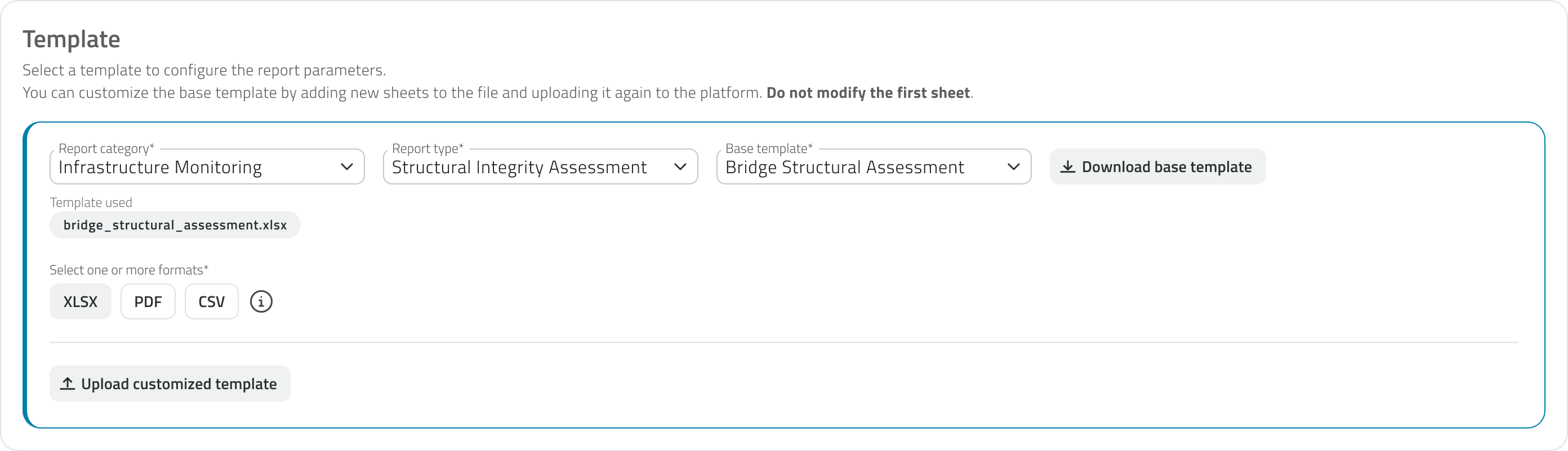
Once the template has been chosen, you can download it using the Download base template button and customise it by adding new sheets to the XLSX file.
To use the customised template, re-upload it using the Upload customised template button. The uploaded file is shown with its name, upload date and time, and can be downloaded or removed. Removing it will automatically revert to the base template.
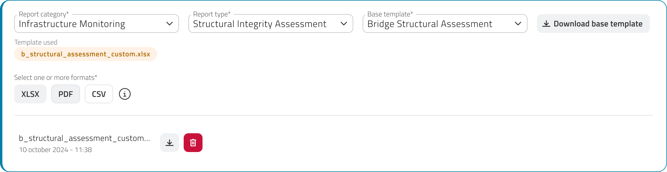
Do not modify the first sheet of the XLSX file: it contains the data structure used by the platform to populate the report.
Parameters section
Once the template has been selected, the Parameters section populates with the parameters to configure, which vary depending on the chosen template. Parameters are divided into two groups, Inputs and Filters, defined by the template itself:
- Inputs are configured here in the Backoffice by indicating where the system should retrieve the data from. They may be mandatory.
- Filters are not configurable: they are shown here so you are aware of their presence, and are filled in by the user in the app at the time of generation to refine the report content. For each filter you can optionally set a display name, which is shown to the user in the app to help them fill in the field; if left empty, the system name is used. Filters that are mandatory for the user are marked with the Required in App label.
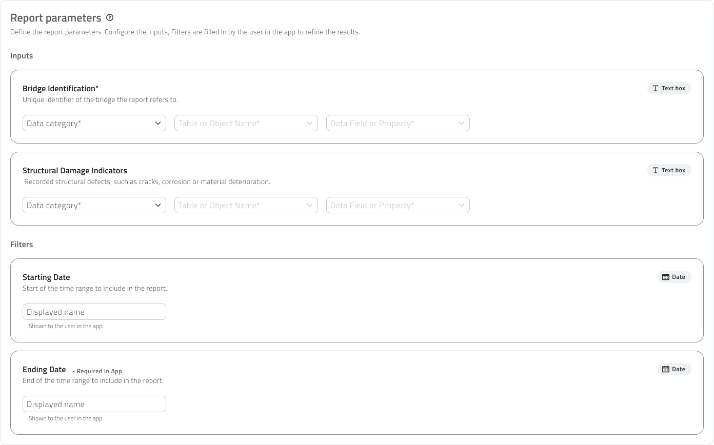
For each Input, the following fields unlock in sequence to indicate where the system should retrieve the data from:
- Data category
The data category to draw from - Table or Object Name
The specific table or object class - Data Field or Property
The specific field or property to use
Parameters can be of different types, such as text, numbers, true/false, date and date and time.
The parameter type is indicative in the Backoffice and helps guide the configuration. For Filters, it determines the type of field the user will need to fill in at the time of generation in the app.
Changing the category, type or base template after having configured the parameters will reset the entire parameter configuration. The system will display a confirmation window before proceeding.
Save the Report
Click Save in the top-right corner to complete the creation. On first save, a window opens to set the default permission to assign to the template for all existing roles. This setting can be modified later from the Roles page of the Backoffice.
View and edit Reports
The report list shows the following information for each element:
- Name
- Base template
The selected base template. - Formats
- Parameters
Hovering over the number shows all parameters available for that template. - Projects
Hovering over the number shows the list of projects in which the template has been added; global reports show 0 because they are managed from the Home. - Creation date
Global reports are recognisable by the globe icon next to their name.
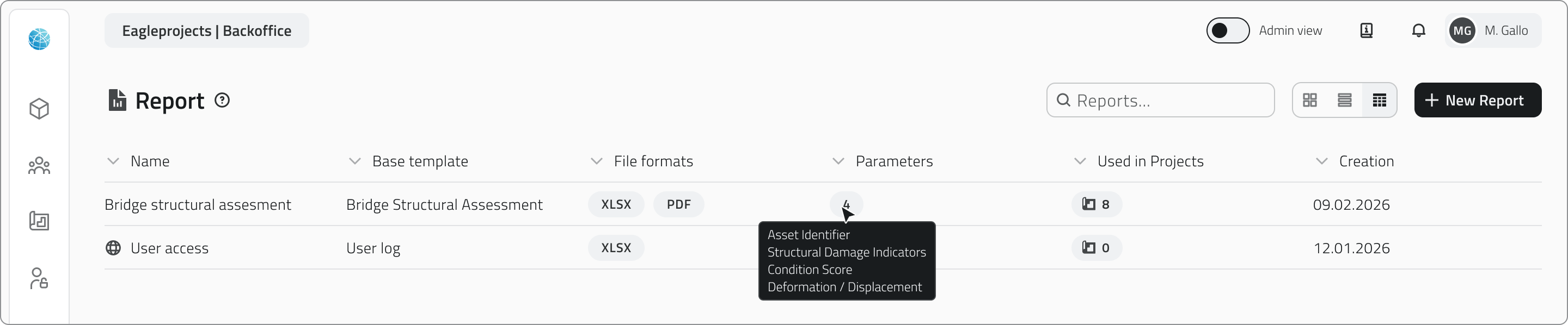
Edit
To edit a report, click the blue button with the arrow icon that appears when hovering over the element.
Duplicate
To duplicate a report, select an element from the list to display the Duplicate button in the top-right corner of the page.
Delete
To delete a report, select one or more elements and click the Delete button in the top-right corner of the page. Hold CTRL and click to add reports to the selection or remove them from it.
Deleting a report template causes the deletion of all instances generated from that template in projects and from the Home. The system shows the number of instances involved before proceeding with the confirmation.
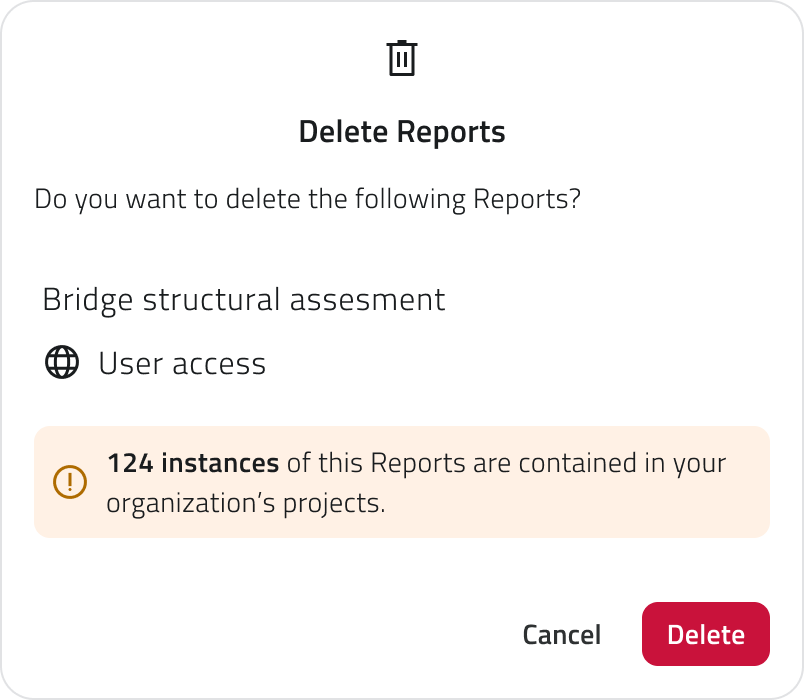
Links
Creare e gestire i report
La sezione Report del Backoffice consente di scegliere e configurare i template di report che verranno poi utilizzati nei progetti o dalla Home per generare report scaricabili. Ogni template definisce la struttura, i parametri e i formati disponibili per la generazione.
Disponibile solo per utenti con permesso backoffice.
Creare un nuovo Report
1. Accedi al Backoffice e clicca su Report nel menu laterale sinistro.
2. Clicca sul pulsante Nuovo report in alto a destra.
3. Inserisci un nome univoco del report nel campo Nome Report (obbligatorio, massimo 40 caratteri).
4. Se il report deve raccogliere dati da tutti i progetti dell'organizzazione, attiva lo switch Global Report.
I report globali vengono gestiti dalla Home e non dai singoli progetti.
5. Compila i campi delle due sezioni.
Sezione Template
In questa sezione i campi si sbloccano progressivamente. Seleziona prima la categoria e poi la tipologia del report: questi due campi ti aiutano a individuare il template più adatto.
A questo punto puoi selezionare il template base e scegliere uno o più formati di output.
Una volta scelto il template, è possibile scaricarlo tramite il pulsante Scarica template base e personalizzarlo aggiungendo nuovi fogli al file XLSX.
Per utilizzare il template personalizzato, ricaricalo tramite il pulsante Carica template personalizzato. Il file caricato viene mostrato con nome, data e ora di caricamento e può essere scaricato o rimosso. Rimuovendolo si tornerà automaticamente al template base.
Non modificare il primo foglio del file XLSX: contiene la struttura dati utilizzata dalla piattaforma per popolare il report.
Sezione Parametri
Una volta selezionato il template, la sezione Parametri si popola con i parametri da configurare, che variano in base al template scelto. I parametri si dividono in due gruppi, Input e Filtri, definiti dal template stesso:
- Gli Input vengono configurati qui nel Backoffice indicando da dove il sistema deve recuperare il dato. Possono essere obbligatori.
- I Filtri non sono configurabili: vengono mostrati qui per darti consapevolezza della loro presenza e vengono compilati dall'utente in app al momento della generazione per affinare il contenuto del report. Per ogni filtro puoi facoltativamente impostare un nome in visualizzazione, che viene mostrato all'utente in app per aiutarlo nella compilazione del campo; se lasciato vuoto, viene usato il nome di sistema. I filtri obbligatori per l'utente sono contrassegnati dall'etichetta Required in App.
Per ogni Input, i seguenti campi si sbloccano a cascata per indicare da dove il sistema deve recuperare il dato:
- Categoria del dato
La categoria di dati da cui attingere - Tabella o Nome oggetto
La tabella o la classe oggetto specifica - Campo del dato o Proprietà
Il campo o la proprietà specifica da utilizzare
I parametri possono essere di diversi tipi, come testo, numeri, vero/falso, data e data e ora.
Il tipo di parametro è indicativo nel Backoffice e aiuta a indirizzare la configurazione. Per i Filtri, determina il tipo di campo che l'utente dovrà compilare al momento della generazione in app.
Modificare la categoria, la tipologia o il template base dopo aver configurato i parametri resetterà tutta la configurazione dei parametri. Il sistema mostrerà una finestra di conferma prima di procedere.
Salvare il Report
Clicca Salva in alto a destra per completare la creazione. Al primo salvataggio si apre una finestra per impostare il permesso di default da assegnare al template per tutti i ruoli esistenti. Questa impostazione può essere modificata in seguito dalla pagina Ruoli del Backoffice.
Visualizzare e modificare i Report
Nella lista dei report sono visibili le seguenti informazioni per ogni elemento:
- Nome
- Template base
Il template base selezionato - Formati
- Parametri
Passando il mouse sul numero vengono mostrati tutti i parametri disponibili per quel template. - Progetti
Passando il mouse sul numero viene mostrata la lista dei progetti in cui il template è stato aggiunto; i report globali mostrano 0 perché sono gestiti dalla Home - Data di creazione
I report globali sono riconoscibili dall'icona del globo accanto al nome.
Modifica
Per modificare un report, clicca sul pulsante blu con l'icona freccia che appare al passaggio del mouse sull'elemento.
Duplicazione
Se vuoi duplicare un report, seleziona un elemento dalla lista per visualizzare il pulsante Duplica in alto a destra della pagina.
Eliminazione
Se vuoi eliminare un report puoi selezionare uno o più elementi e cliccare sul pulsante Elimina in alto a destra della pagina. Tieni premuto CTRL e clicca per aggiungere report alla selezione o toglierli.
Eliminare un template di report comporta l'eliminazione di tutte le istanze generate da quel template nei progetti e dalla Home. Il sistema mostra il numero di istanze coinvolte prima di procedere con la conferma.
Collegamenti
Last update: 11 June 2026
Create and manage Automations
Automations allow the platform to respond automatically to incoming events, executing one or more actions in sequence, from sending notifications to users to creating or updating objects on the platform.
Available only to users with backoffice-admin permission.
Create a new automation
1. Log in to the Backoffice and open the Automations section from the side menu.

2. Click New Automation in the upper-right corner.
3. Enter the name of the automation in the page header. This field is required.
4. Select the groups to associate with the automation using the multi-search field. Groups define the visibility of the automation in the app.
5. Set the automation status using the switch at the top. By default, it is enabled.
If the status is disabled, the configuration sections are locked.
New automations are active by default.

The page is divided into two areas:
- On the left is the flow summary, with the trigger card and the cards for any added actions
- On the right is the configuration panel for the selected section
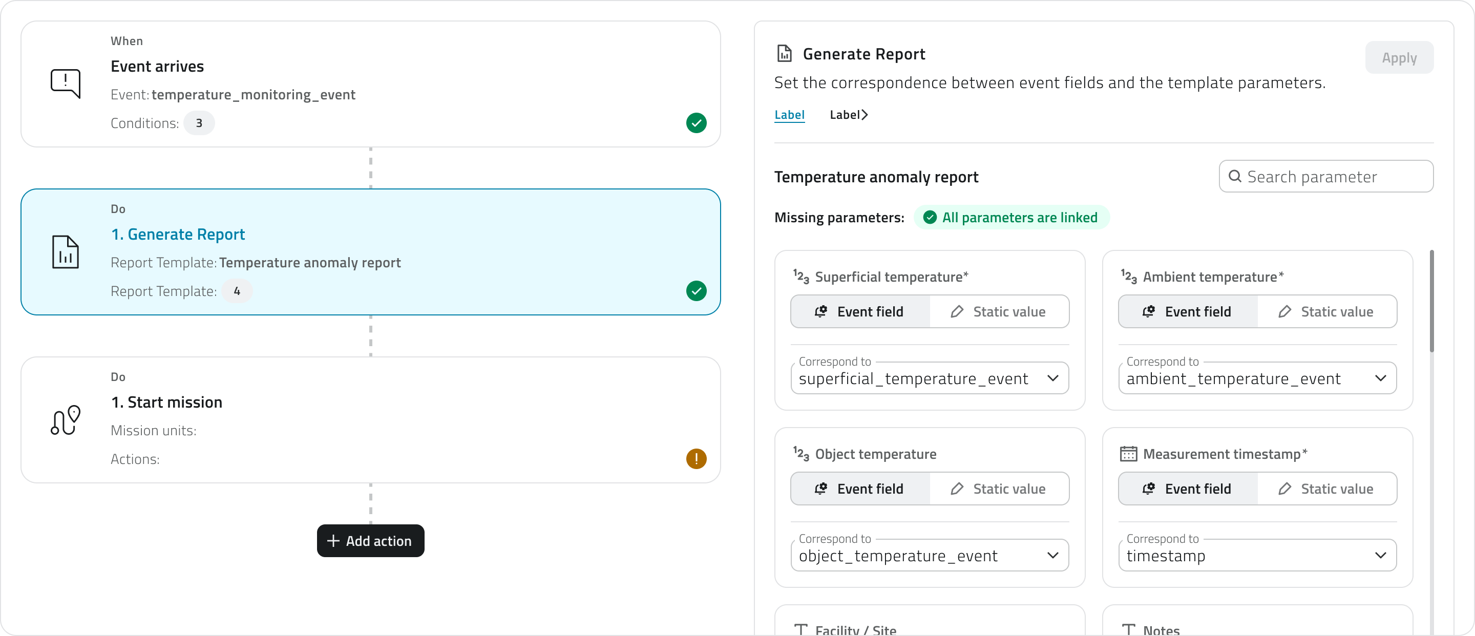
The trigger and action cards display their status via an icon: an exclamation mark on a yellow background (Pending) indicates a configuration that is incomplete or not yet confirmed, while a checkmark on a green background (Completed) indicates a complete and confirmed configuration.
The page has two distinct save levels. The Apply button confirms the configuration of the individual section and updates the card status. The Save button in the upper-right corner saves the entire automation definitively.
6. Configure the trigger ↓ to define when the automation should run.
7. Add and configure actions ↓ to choose what the platform should do when the trigger fires.
8. Save the automation by clicking Save in the upper-right corner of the page.
💡 Tip: Before saving, make sure all cards are in the Completed state, so that the automation is saved with a complete and consistent configuration.
Configure the trigger
The trigger defines when the automation should run.
It is the first section to complete: until the trigger is configured and confirmed, the button to add actions is not available.
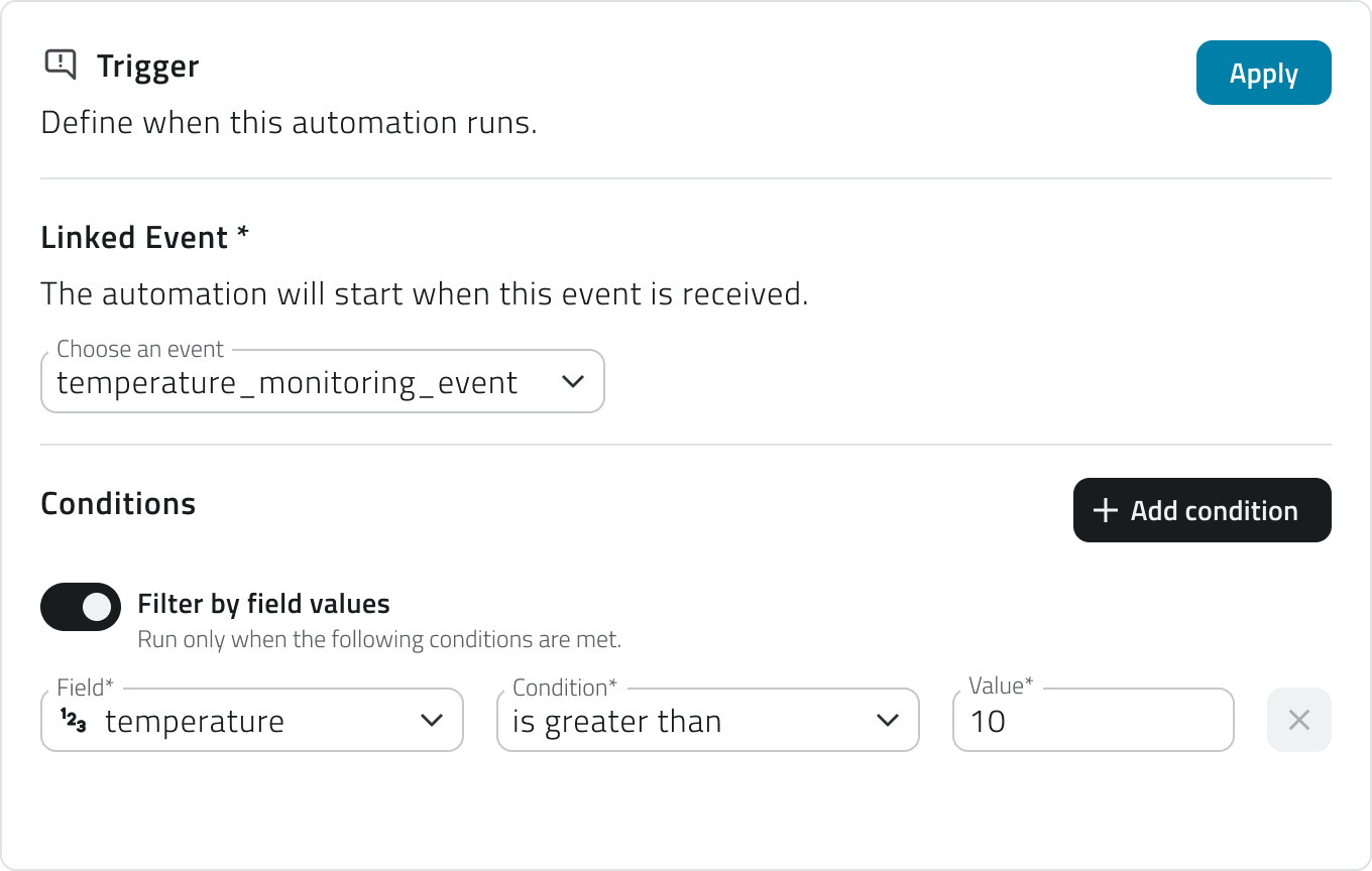
1. Select the linked event from the dropdown menu. The list shows all events configured for the organization.
Events already associated with another automation are not available.
2. If you want the automation to activate only when specific conditions are met click on Add condition.
In this case, for each condition you will need to fill in three required fields:
- Field
Select one of the fields mapped in the event. Each field is accompanied by an icon indicating the data type (text, number, date, boolean). - Condition
Select the condition, for example equal to, greater than, less than, etc. The list of conditions depends on the data type. - Value
Enter the comparison value
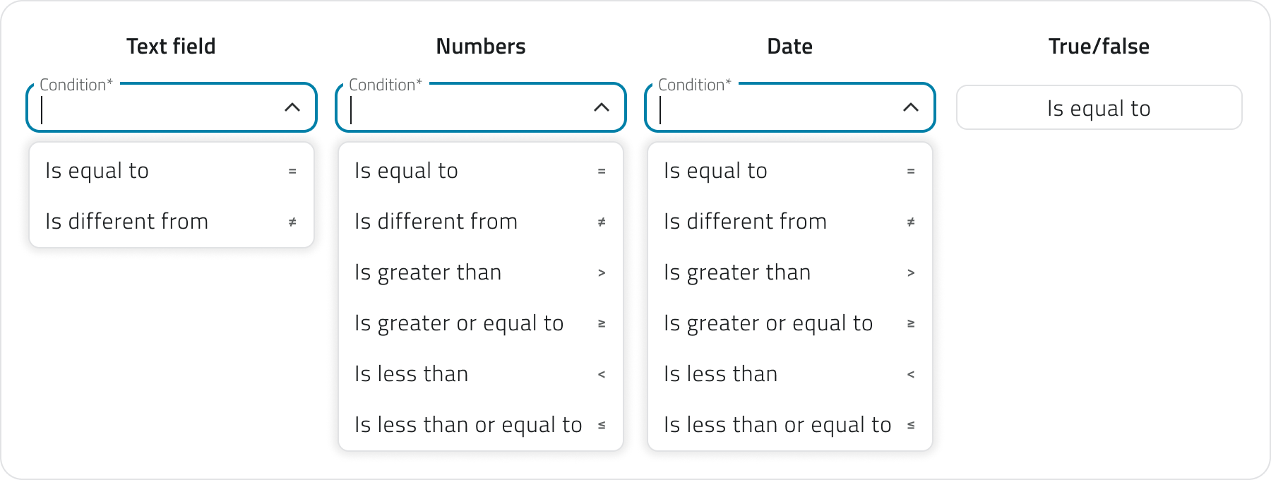
You can add more conditions using the Add condition button.
If multiple conditions are present, all of them must be satisfied simultaneously to activate the trigger.
If you don't add any conditions, the automation fires every time the event is received.
3. Click Apply to confirm the trigger. The card will move to the Completed state and the button to add actions will become available.
If you later change the linked event, all already configured conditions will be reset. You can undo the change via Discard changes to restore the previous configuration.
Add and configure actions
Once the trigger is confirmed, click Add action to choose the type of action to execute. The available actions depend on the entity the event selected in the trigger is linked to.
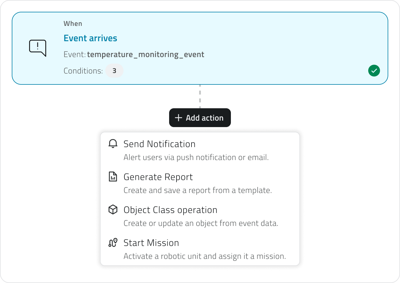
If the event is linked to a project, an object, or a sensor, all action types are available.
If the event is linked to an organization or a device, only send notification is available.
The available action types are:
- Send notification ↓
Sends an email or push notification to the selected recipients. - Object class operation ↓
Creates or updates an instance of an existing object class.
Once the type is selected, the configuration panel opens on the right. The configuration is structured in progressive steps: each step unlocks only after the previous one has been completed and confirmed via the Continue button.
When you have finished configuring the action, click Apply to add it to the flow. The action card will appear in the left column with a summary of the main settings.
For each action you must also define the error behavior, choosing whether the system should continue with the next action or stop the entire automation.
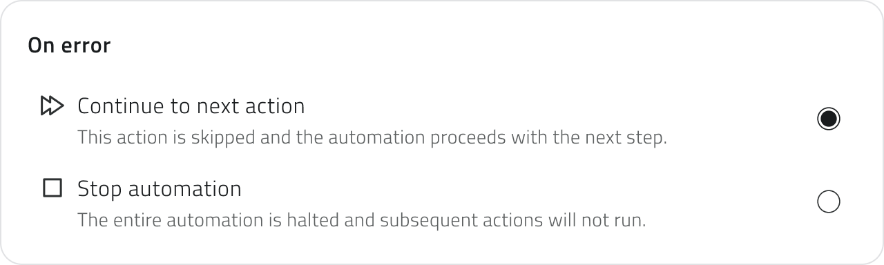
You can add an unlimited number of actions.
To change the execution order, drag the cards up or down in the left column. The order in which the cards appear corresponds to the actual execution order.
💡 Tips:
- If the actions are independent of each other, choose to continue with the next action to prevent a single issue from blocking the entire flow
- If the actions are chained and depend on one another, choose to stop the automation to avoid inconsistent partial executions
Send notification
Configure the automatic sending of an email or push notification.
1. Select the notification type: Email or Push. Each action handles a single channel. To send both email and push, add two separate actions.
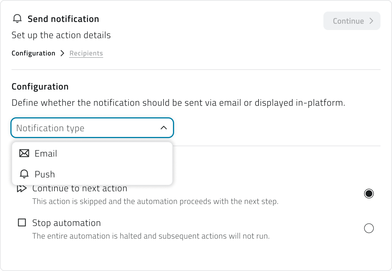
2. Click Continue to access the Recipients section.
3. You can add optional conditions to limit delivery to specific occurrences of the event, filtering by severity level (info, warning, success, error) or by specific event name.
4. Add the recipients by selecting users or groups. For email notifications you can also add external email addresses.
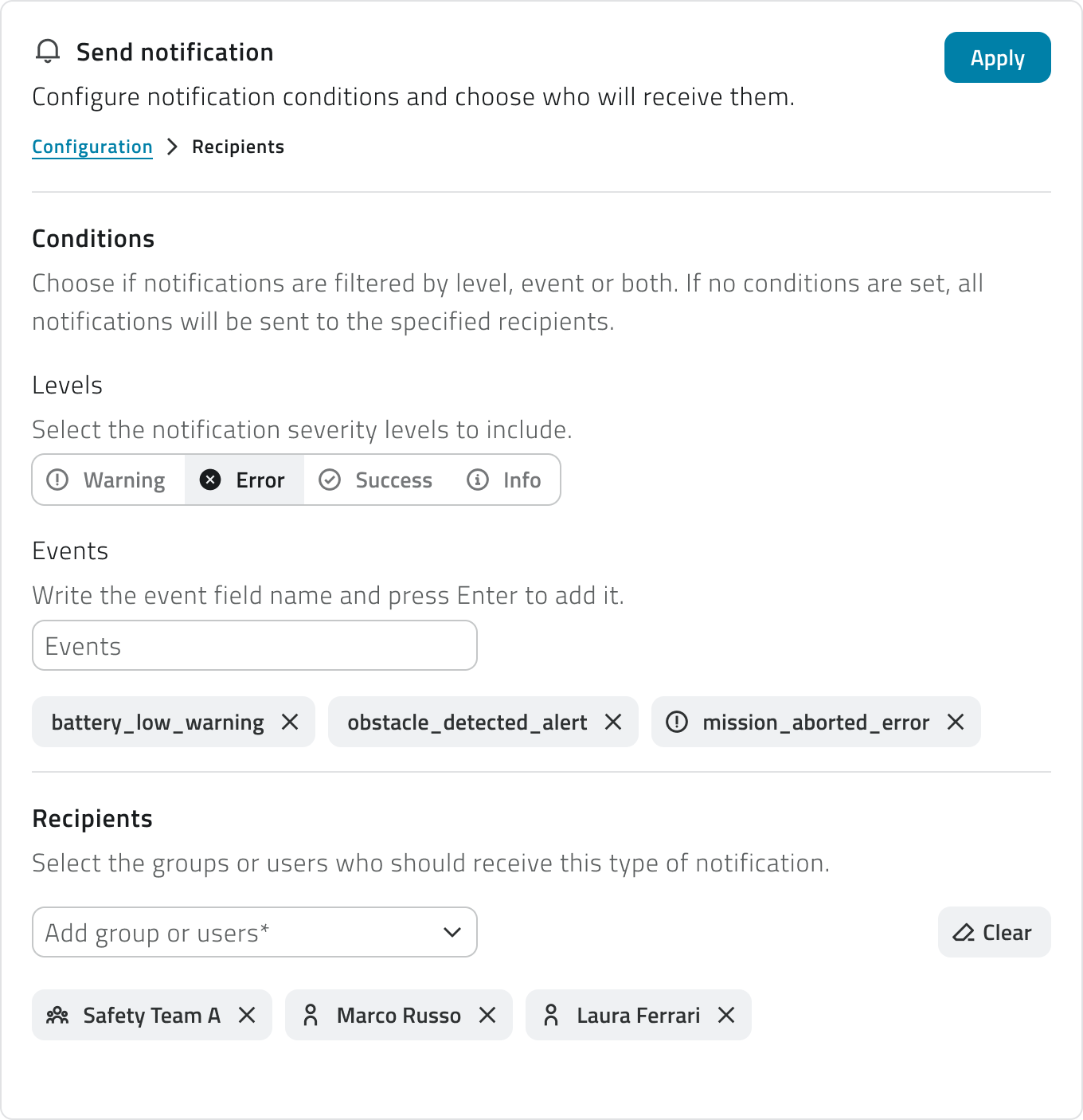
5. Click Apply to confirm.
Object class operation
Configure the automatic creation or update of an object class instance.
1. Select the object class from the dropdown menu.
2. Select the operation to perform:
- Create object
Creates a new instance of the class. Available for classes of type Point and Form. - Modify object
Updates an existing instance. Available for all class types.
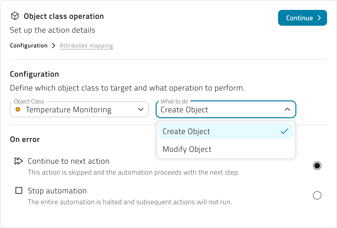
The Point creation action is only available if the linked event has a coordinates field correctly configured.
3. Click Continue to access the Attributes mapping section.
4. Choose how to populate each class attribute: with the event field, where the value is read from a field of the received event that you will select from a dropdown menu, or with a static value, by entering a fixed value manually.
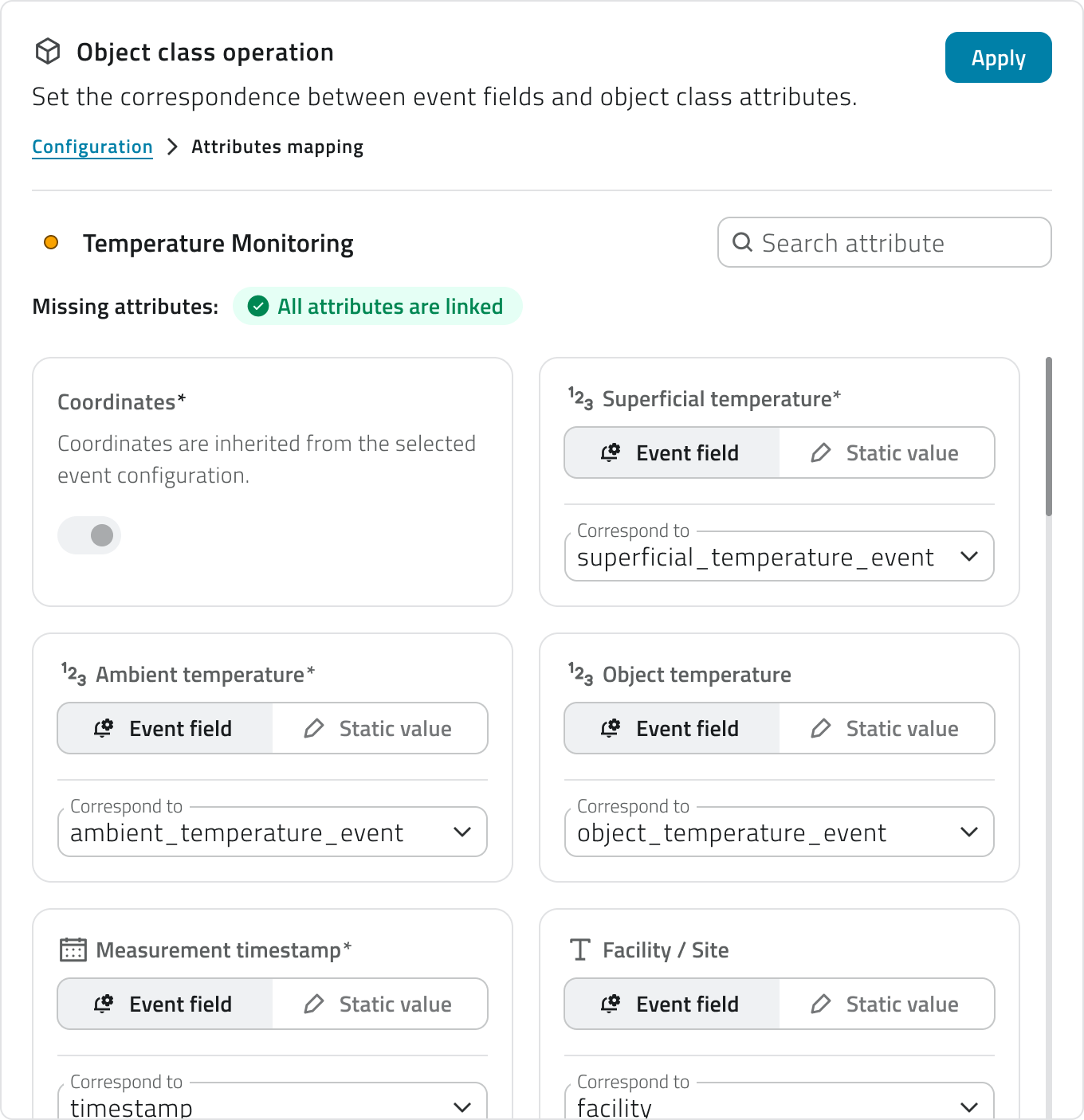
Required attributes are marked with an asterisk and must all be populated. A counter updated in real time showing the missing attributes is displayed at the top. A search bar allows you to filter the attribute list.
For classes of type Point, the Coordinates field is managed automatically: during creation it is populated from the coordinates field configured in the event and cannot be edited manually. During a modification it is optional.
For the Modify object operation, the Unique identifier field is required to indicate which instance to update. It can be mapped from an event field or entered as a static value.
5. Click Apply to confirm.
If you change the object class, the attribute mapping will be reset and the selected operation will be invalidated.
View and manage automations
The list shows all configured automations with the following information:
- Name of the automation
- Status active or inactive, shown via icon
- Actions total number of configured actions; hovering over the number shows the list in execution order
- Creation date
The list can be viewed in table, grid, or list mode.
Two warning states may appear in the list:
- Warning icon next to the name
The automation is saved but has no actions configured yet. - Alert icon next to the name
The event linked to the trigger has been deleted. The automation is automatically deactivated and cannot run until a new valid event is selected.
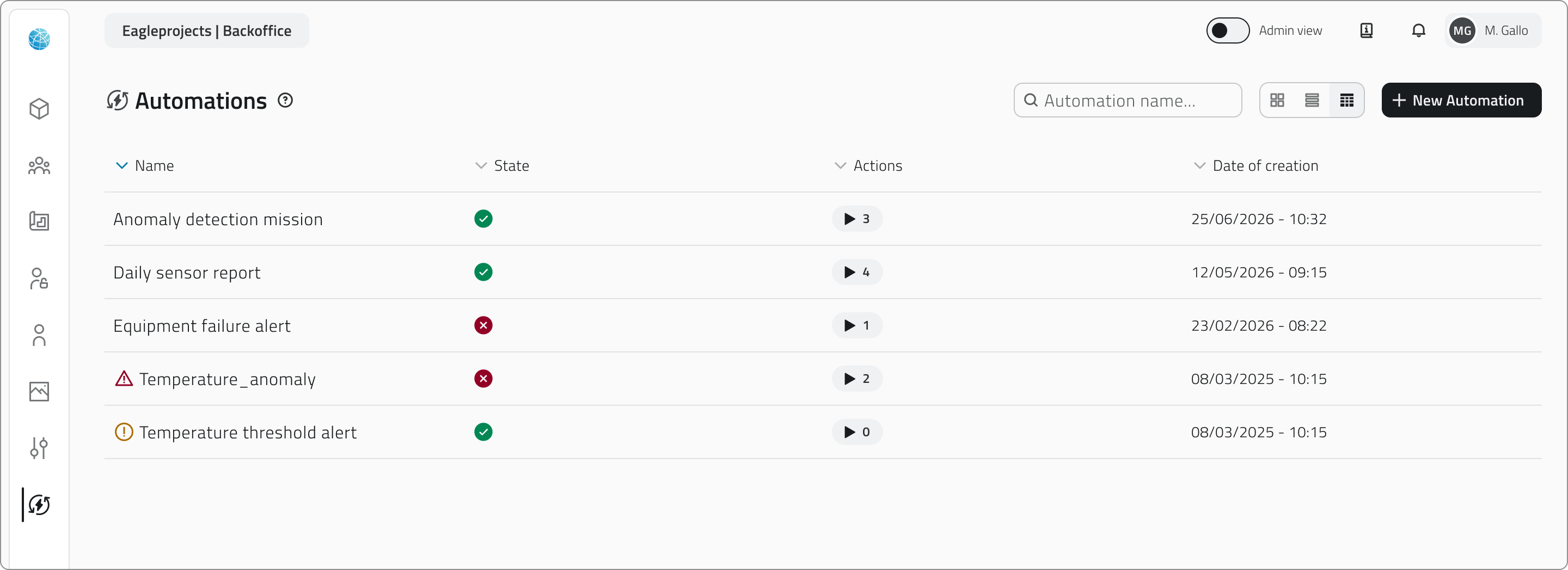
To edit an automation, click the blue button with the arrow icon that appears when hovering over the item.
When you edit a section, the related card returns to the Pending state. You can confirm the changes via Apply or discard them via Discard changes, which restores the last saved configuration.
If you edit a field that affects subsequent configurations, such as the unit type in a mission or the object class in an operation, the dependent steps are automatically reset and must be reconfigured.
You can also change the action order by dragging the cards, and add or remove individual actions.
Changes are not final until the automation is saved.
Delete an automation
From the main list, select one or more automations and click the Delete button. The system shows a confirmation dialog with the names of the selected automations and a warning that all actions configured within them will stop running. Hold CTRL and click to add automations to the selection or remove them from it.
Deleting an automation permanently removes the trigger, all conditions, and all actions configured within it. This action cannot be undone.
Links
- Create and manage Events
- Create and manage Reports
- Create and manage Object Classes
- Mission Planner - Initial Setup
Crea e gestisci le automazioni
Le automazioni consentono alla piattaforma di rispondere automaticamente alla ricezione di un evento, eseguendo una o più azioni in sequenza, dall'invio di notifiche agli utenti alla creazione o all'aggiornamento di oggetti sulla piattaforma.
Disponibile solo per utenti con permesso backoffice-admin.
Creare una nuova automazione
1. Accedi al Backoffice e apri la sezione Automazioni dal menu laterale.
2. Clicca su Nuova automazione in alto a destra.
3. Inserisci il nome dell'automazione nell'intestazione della pagina. Il campo è obbligatorio.
4. Seleziona i gruppi a cui associare l'automazione tramite il campo di ricerca multipla. I gruppi definiscono la visibilità dell'automazione nell'app.
5. Imposta lo stato dell'automazione tramite l'interruttore in alto. Di default è attivo.
Se lo stato è disattivo, le sezioni di configurazione risultano bloccate.
La pagina è divisa in due aree:
- A sinistra si trova il riepilogo del flusso, con la scheda del trigger e le schede delle azioni aggiunte
- A destra si trova il pannello di configurazione della sezione selezionata
Le schede del trigger e delle azioni mostrano il loro stato tramite un'icona: il punto esclamativo su sfondo giallo (In attesa) rappresenta una configurazione incompleta o non ancora confermata, mentre la spunta su sfondo verde (Completato) rappresenta una configurazione completa e confermata.
All'interno della pagina sono presenti due livelli di salvataggio distinti. Il pulsante Applica conferma la configurazione della singola sezione e aggiorna lo stato della scheda. Il pulsante Salva in alto a destra salva l'intera automazione in modo definitivo.
6. Configura il trigger ↓ per stabilire quando l'automazione dovrà essere eseguita.
7. Aggiungi e configura le azioni ↓ per scegliere cosa la piattaforma dovrà fare a seguito del trigger.
8. Salva l'automazione cliccando Salva in alto a destra della pagina.
💡 Suggerimento: Prima di salvare, verifica che tutte le schede siano nello stato Completato. Una scheda in stato In attesa impedisce il salvataggio dell'automazione.
Configurare il trigger
Il trigger definisce quando l'automazione deve essere eseguita.
È la prima sezione da completare: finché il trigger non è configurato e confermato, il pulsante per aggiungere azioni non è disponibile.
1. Seleziona l'evento collegato dal menu a tendina. La lista mostra tutti gli eventi configurati per l'organizzazione.
Gli eventi già associati a un'altra automazione non sono disponibili.
2. Se vuoi che l'automazione si attivi solo al verificarsi di condizioni specifiche clicca su Aggiungi condizione.
In questo caso, per ogni condizione, dovrai compilare tre campi obbligatori:
- Campo
Seleziona uno dei campi mappati nell'evento. Ogni campo è accompagnato da un'icona che indica il tipo di dato (testo, numero, data, booleano). - Condizione
Seleziona la condizione, per esempio uguale, maggiore, minore, ecc. La lista delle condizioni dipende dal tipo di dato. - Valore
Inserisci il valore di confronto
Puoi aggiungere più condizioni tramite il pulsante Aggiungi condizione.
Se sono presenti più condizioni, per attivare il trigger devono essere tutte soddisfatte contemporaneamente.
Se non aggiungi condizioni, l'automazione si avvia ogni volta che l'evento viene ricevuto.
3. Clicca Applica per confermare il trigger. La scheda passerà allo stato Completato e si abiliterà il pulsante per aggiungere azioni.
Se in seguito modifichi l'evento collegato, tutte le condizioni già configurate vengono azzerate. Puoi annullare la modifica tramite Scarta modifiche per ripristinare la configurazione precedente.
Aggiungere e configurare le azioni
Dopo aver confermato il trigger, clicca su Aggiungi azione per scegliere il tipo di azione da eseguire. Le azioni disponibili dipendono dall'entità a cui è collegato l'evento selezionato nel trigger.
Se l'evento è collegato a un progetto, un oggetto o un sensore, sono disponibili tutti i tipi di azione.
Se l'evento è collegato a un'organizzazione o a un dispositivo, è disponibile solo l'invio di notifiche.
I tipi di azione disponibili sono:
- Invia notifica ↓
Invia una notifica email o push ai destinatari selezionati. - Operazione su classe oggetto ↓
Crea o modifica un'istanza di una classe oggetto esistente.
Una volta selezionato il tipo, il pannello di configurazione si apre a destra. La configurazione è strutturata in step progressivi: ogni step successivo si sblocca solo dopo aver completato e confermato il precedente tramite il pulsante Continua.
Quando hai terminato la configurazione dell'azione, clicca Applica per aggiungerla al flusso.
La scheda dell'azione apparirà nella colonna di sinistra con un riepilogo delle impostazioni principali.
Per ogni azione devi anche definire il comportamento in caso di errore, scegliendo se il sistema deve continuare con l'azione successiva oppure interrompere l'intera automazione.
Puoi aggiungere un numero illimitato di azioni.
Per cambiare l'ordine di esecuzione, trascina le schede verso l'alto o verso il basso nella colonna di sinistra. L'ordine in cui le schede compaiono corrisponde all'ordine effettivo di esecuzione.
💡 Suggerimenti:
- Se le azioni sono indipendenti tra loro, scegli di continuare con l'azione successiva per evitare che un singolo problema blocchi l'intero flusso
- Se le azioni sono concatenate e dipendono l'una dall'altra, scegli di interrompere l'automazione per evitare esecuzioni parziali incoerenti
Invia notifica
Configura l'invio automatico di una notifica email o push.
1. Seleziona il tipo di notifica: Email o Push. Ogni azione gestisce un solo canale. Per inviare sia email che push, aggiungi due azioni separate.
2. Clicca Continua per accedere alla sezione Destinatari.
3. Puoi aggiungere condizioni opzionali per limitare l'invio solo ad alcune occorrenze dell'evento, filtrandole per livello di severità (info, avviso, successo, errore) o per nome evento specifico.
4. Aggiungi i destinatari selezionando utenti o gruppi. Per le notifiche email puoi aggiungere anche indirizzi email esterni.
5. Clicca Applica per confermare.
Operazione su classe oggetto
Configura la creazione o la modifica automatica di un'istanza di una classe oggetto.
1. Seleziona la classe oggetto interessata dal menu a tendina.
2. Seleziona l'operazione da eseguire tra:
- Crea oggetto
Crea una nuova istanza della classe. Disponibile per classi di tipo Punto e Form. - Modifica oggetto
Aggiorna un'istanza esistente. Disponibile per tutti i tipi di classe.
L'azione di creazione di un Punto è disponibile solo se l'evento collegato ha un campo coordinate correttamente configurato.
3. Clicca Continua per accedere alla sezione Mappatura attributi.
4. Scegli come popolare ogni attributo della classe, se con il campo dell'evento, il valore viene letto da un campo dell'evento ricevuto che dovrai selezionare da un menu a tendina, oppure con un valore statico, inserendo manualmente un valore fisso.
Gli attributi obbligatori sono contrassegnati da un asterisco e devono essere tutti popolati. In alto viene mostrato un contatore aggiornato in tempo reale con gli attributi mancanti. Una barra di ricerca consente di filtrare la lista degli attributi.
Per le classi di tipo Punto, il campo Coordinate è gestito automaticamente: in fase di creazione viene popolato a partire dal campo coordinate configurato nell'evento e non è modificabile manualmente. In fase di modifica è opzionale.
Per l'operazione Modifica oggetto è obbligatorio configurare il campo Identificatore univoco, che indica quale istanza aggiornare. Può essere mappato da un campo evento o inserito come valore statico.
5. Clicca Applica per confermare.
Se modifichi la classe oggetto, la mappatura degli attributi viene azzerata e l'operazione selezionata viene invalidata.
Visualizzare e modificare le automazioni
La lista mostra tutte le automazioni configurate con le seguenti informazioni:
- Nome dell'automazione
- Stato attivo o disattivo, mostrato tramite icona
- Azioni numero totale di azioni configurate; passando il mouse sul numero, viene mostrato l'elenco in ordine di esecuzione
- Data di creazione
La lista può essere visualizzata in modalità tabella, griglia o elenco.
Nella lista possono comparire due stati di attenzione:
- Icona di avviso accanto al nome
L'automazione è salvata ma non ha ancora azioni configurate. - Icona di allerta accanto al nome
L'evento collegato al trigger è stato eliminato. L'automazione viene automaticamente disattivata e non può essere eseguita finché non viene selezionato un nuovo evento valido.
Per modificare un'automazione, clicca sul pulsante blu con l'icona freccia che appare al passaggio del mouse sull'elemento.
Quando modifichi una sezione, la relativa scheda torna allo stato In attesa. Puoi confermare le modifiche tramite Applica oppure annullarle tramite Scarta modifiche, che ripristina l'ultima configurazione salvata.
Se modifichi un campo che ha impatto su configurazioni successive, ad esempio il tipo di unità in una missione o la classe oggetto in un'operazione, gli step dipendenti vengono automaticamente azzerati e devono essere riconfigurati.
Puoi anche modificare l'ordine delle azioni trascinando le schede, e aggiungere o rimuovere azioni singole.
Le modifiche non sono definitive fino al salvataggio dell'automazione.
Eliminare un'automazione
Dalla lista principale, seleziona una o più automazioni e clicca sul pulsante Elimina. Il sistema mostra una finestra di conferma con il nome delle automazioni selezionate e un avviso che tutte le azioni configurate al loro interno cesseranno di essere eseguite. Tieni premuto CTRL e clicca per aggiungere automazioni alla selezione o toglierle.
Eliminando un'automazione vengono rimossi definitivamente anche il trigger, tutte le condizioni e tutte le azioni configurate al suo interno. L'operazione è irreversibile.
Collegamenti
- Creare e gestire gli Eventi
- Creare e gestire i Report
- Creare e gestire le Classi Oggetto
- Mission Planner - Setup iniziale
Last update: 17 Aug 2026